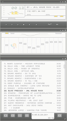
Yello-amp
A minimalistic skin for minimalistic desktops!
A minimalistic skin for minimalistic desktops!Here is a skin which ive been longing to publish. This skin was originally created for the 40s suite initiated by ~imrik [http://imrik.deviantart.com]. At some point of time me and imrik lost touch and we never got the chance to discuss about the suite. This skin will look good on any wallpaper (Ive personally tested it). But it will look cooler on imriks wallpapers. You can get wallpapers created by him at his website [http://4imp.de].
Download skin| February 16, 2005 by vasanth vasudevan | 44589 downloads |

Staff review
So minimal, it doesn't even need a W.This skin sacrifices a bit of usability for style, but that's minimalism for you. It's very slick, very well done, but not much yellow for a skin called Yello.
Comments
Looks Awesome, Functions Even Better! - I love the clean look and feel of this skin. In my opinion it should be showcased in one of the feature skins lists if not included with Winamp when you first download it. Keep up your great work! --5/5 - March 5, 2006 by Bill McGowan
. - By far my favourite skin, and one I keep returning to. Very clean & clear-cut, but not unfriendly, and has a full range of desirable features. Unobtrusive and therefore highly usable; the colour scheme is also very pleasant and goes with almost anything. Definitely an excellent skin. - January 19, 2006 by synalle neakail
I LOVE THIS SKIN - yeah like what i said on the title, i love this skin a lot. it's so simple yet elegant. i especially love the double size option!!! - December 29, 2005 by Jennifer Lai
Buttons missing - Buttons in a playlist window are missing. Junk. - December 23, 2005 by Winston Smith
nice, but only one thing... - i like it! it's smooth and stylish. there's only one thing: make the buttons bigger and i'd give 5 stars. - June 12, 2005 by Paul Popowiczyk
. - Great style; love the appearance. For its tininess a bit difficult to use, but great nonetheless. - April 29, 2005 by synalle neakail
Whoo-hoo. Sun. =) - It's so SUNNY! It's so BRIGHT! It's so kewl. =3 Rock it, I say, I say. - March 21, 2005 by Katana Akaissei
Thank you! - Thank you for the wonderful comments! I really appreciate it! - March 9, 2005 by vasanth vasudevan
NaiCE!!! - Thin but thick-enough... Neat n Simple but cool enough... small but larger than life... Hey, smaller the skin Cooler it gets!!!... - February 21, 2005 by Pradyumna Nandavanam
GREAT! - in one word: BEE-YOO-TI-FUL. - February 21, 2005 by Caro Pan
Loving It - I love the colours, I like how it all "connects". Although I'd change the font to a larger more readable one, which I can do myself anyway, so, great skin! Goes well with my desktop. :) Thanks. - February 18, 2005 by James Gartland
My ass - So minimal it doesn't deserve 5 stars. I'm sorry the usability is sh*t not to mention i could pull this off in acouple hours. Next time put some real effort into it. - February 17, 2005 by David Davis

 Home
Home
