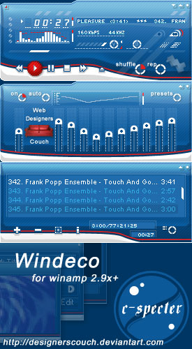
Windeco
xmas present for designerscouch
xmas present for designerscouchWindeco|
i was asked by depthskins to create a skin as a xmas present for the members of the designerscouch club @ deviantart.
some very talented artist hang around there.
working time: ~14h
http://designerscouch.deviantart.com
i hope you enjoy the skin and feel free to dl, comment or visit club. thx
/c-spec
| December 28, 2005 by c - specter | 467018 downloads |

Staff review
And what a present it is...A beautiful little thing that just screams "class". Lovely and soothing shades of blue dominate this detail-filled skin. A great flowing design reminiscent of some classics, like Ampburner's Liquid Paradise. Nice use of transparencies, too. Another proof that a skin doesn't need to be "metallic" to be great.
Comments
Nice - Thank you for this skin!It's very nice and clear to use! - January 7, 2008 by luckyastro Mary
One of my favorites - This skin is a fav of mine. It's clean but at the same time enjoyable to look at. This skin is for sure one to download. - November 17, 2007 by Paul J
Bhavik Gami Cuba - ehhhhhhhhhh thiss reminds me of how i go skiing in my albo gear in cubaaaaa. i like what i see, i lav it, its marvellous. im not used to seing such sights being cuban ehhhhhhhhhhh. im depressd now. hridai says hi. - October 12, 2006 by Hridai trivedy
Wow! - Cutie and Cool version of "Deep Blue Sea" =P I like it! - August 8, 2006 by RuRu Tang
this one... - is on my "nicely nice skins collection" lol - April 25, 2006 by jOsSse Cores
Great skin - This is a wonderful little skin right here. I really like the color scheme and the abstract background on the interface itself. The only thing I don't like is the little "web designers couch" on the EQ window, but that's such a minor thing that I'm still giving this 5 stars. Excellent work! - January 25, 2006 by Aaron Boswell
Your Best So Far - in my humble opinion, this is your best skin so far... just because i love design...i think that some of your older skins were some kind of mix. I think that, for example, the volume bar of "red cobra" could have been a different one, something more elavorated, but in this skin, that kind of volume bar fits perfectly... also i love the colors and it's simplicity...a cool and easy to use skin... good job - January 17, 2006 by El-ArGeNtO (Fernando Adorneti)
Always - ...a pleasure to see your work! Quite surprising and unlike your other skins but a sight for sore eyes. - December 28, 2005 by Jan Gjestad
VERY nice - that little red line is brilliant! - December 28, 2005 by De_Bie Pieter

 Home
Home
