WinampMP11
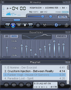
Winamp Media Player 11
Winamp Media Player 11Based on the new Windows Media Player 11 skin
last edit didnt update the skin or preview images, trying again
| September 23, 2006 by Ki_Shodar Mirabeau | 1320011 downloads |

Staff review
Another windows media player skin, how many more can we take?
Comments
I like this. Clear and crisp. Legible. Functional. These are all values not to be sneered at. - December 11, 2009 by stevezv
duh - Thank you bunchies for your rubbish review, dear staff. This skin is small, simple, clean and yet pretty (unlike any other wmp skin or most skins in general, including winamp default ones) - some people still seek that. Good job. - July 27, 2009 by airdropit
Lovely!! - Doesn't make me miss WMP11 anymore! - May 23, 2009 by iam
awesome - this is so simple, so nice and clean. Exactly what I was looking for.simply cool! - May 9, 2009 by Angel donchev
nice - it's not anything special, but can be used - March 8, 2009 by Yangombi Umpakati
very clean - very nice skin! - January 18, 2009 by egnegn egnegn
neat - thanks! - August 12, 2008 by schafw ollsocki
Awesome work - clean and simple just the way i like it - March 16, 2007 by Sebastian Baldovino
Love it!!! - The vest skin I ever used - it's clean, no bugs, looks great... I love it!!! - November 14, 2006 by Maja MM
yg - gg - November 13, 2006 by adiga adiga
WinampMP11 - Classic - November 7, 2006 by Wanida Kimura
O melhor que já vi para classic - Este concerteza é o skin mais leve e bonito para winamp classic. Indico ele para todos, muito bem feito. Por Thiago Rodrigues, Brasil. - November 2, 2006 by Thiago Rodrigues
play button - whay u dont use the play button to pause like in media player - October 11, 2006 by pdr manuel
nice... - Hi!! nice skin....could you please send me the template from this skin because i just started skinning and i think it's a good basic to start with.... Pat [email protected] - October 6, 2006 by Patrick Neumann
yes... maybe - this is the first skin i felt the need to register in order to comment for. i used to use d-reliction... still a great skin, but i really really like this one good colors, apparent buttons, not hard to see. to be honest, i think its called glass, but i dont like the glassiness of the skin. i prefer it more flat, also notice how the forward and reverse buttons are more glassy than the others... best of the mp11 skins and great job... thanks! - October 5, 2006 by fnloser fnloser
... - kjkhutytr - September 29, 2006 by marta mendez
Not too bad. - I actually quite like this one. It's nice and efficient, and really easy on the eyes. - September 28, 2006 by Paul Smith
Simple is pretty - This skin is one of those rare gems that grows to be a classic. It is exquisitely neat and easy on the eyes, its functions clearly displayed and well blended. An instant hit and one that will stay in my collection till the end of time. The only place where a question can be asked is with the colouring of the text of a non-playing but selected playlist entry, which could be a touch darker to be easier to see. That said, it deserves a perfect 10 as it is virtually without flaw. Simply brilliant. - September 28, 2006 by Juliusz Szczygiel
Good Skin - I like the layout of the new Windows Media Player 11 Beta. The colours really does match it. - September 25, 2006 by Ahmad Hassan

 Home
Home
