Winamp Media Player 10
Based on Windows Media Player 10
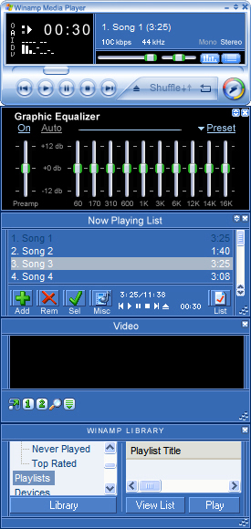
Based on Windows Media Player 10This skin is based entirely on Windows Media Player 10. If you prefer the appearance of Windows Media Player 10 as I do, then you will like this skin.
Download skin| July 7, 2005 by Matthew Sher | 292433 downloads |

Staff review
Approved.Not the first one, but it works.
Comments
Needs work - The main player window looks really great, but the rest of the windows ('Now Playing' list, Winamp Library etc.) don't look good at all. I don't know if that is what they look like on WMP10 (as I have never used it) but the skin would look much better if the various parts matched the main player style. - October 22, 2006 by Oomingmak R
Horrible - This skin is a waste of effort, you should finish it, because it don't look finished. God Bless, and Good Luck. - June 21, 2006 by A W
Nice! - This is an excellent skin! It looks sharp and everything is right there in front of you. Its like Windows Media Player (only not shitty and frustrating). - March 13, 2006 by Red McCaster
make it perfect please - this one looks GREAT, exactly what i wanted. Just one thing is bothering me, wich is that the Playlist and the library isn't skinned proparly. I think this could and should be done better. Just to round things of. aparte de eso, perfecto jonesses - November 19, 2005 by Jonas Roberts
Niiice - Finally, Something to go with the Media Style Windows XP, which for some reason, I adore. Good Job Mattew! - November 4, 2005 by Mathieu Legault
good - mmm this one is perfect for people who likes winamp functions and windows media design it really looks like wmp but what i really liked was that logo =D - October 11, 2005 by ignacio bravo
Damn good... :D - WMPlayer Out! Winamp in! - September 5, 2005 by Furkan G�NAY
Its a perfect hybrid - Its a perfect hybrid - August 29, 2005 by Sean Harris
Sure...why not? - If you like the look of Windows Media Player 10, but hate how much of your computer's resources WMP takes up, this skin is for you. Easy to use too. - August 23, 2005 by Shaun Quinn
cool - very coooooolllllllllllllllllllllllllllllllllllllllllllllllllllll - August 20, 2005 by Frank Leven
Detail - I cannot belive how you did it!! It's so simular to the real module of Windows Media 10 tm. I am Impressed. I have one more comment, I challenge you to make a replica of windows media player 9 tm. See if you can that! >:) - August 20, 2005 by Blake Nguyen
black eq? - the black eq seems totally out of place to me nice skin tho... if you like WMPs scheme. The 'reflectivity' of the main winamp window looks nice :) - August 15, 2005 by Semi Essessi
Good work - I like the easy to use skins like this, you can see the buttons and I think this is one of the best WMP replicas I've seen. - August 1, 2005 by CODE_10100 AOC
Nice! - This is a great replica! Nice tuch on the winamp Vs Windows media player logo... - July 15, 2005 by Baard Fleistad
Windows Media Player - This skin is a good replica. It is easy to use, handy to have and looks GREAT. A little hard to get used to after the sleeek lines of the classic skin, but worth it in the end. - July 12, 2005 by Matthew Harrison

 Home
Home
