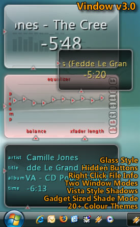
Vindow v3
A skin for Vista
A skin for VistaThis skin has been designed mainly for Vista or glass style desktops.
All the buttons on the main screen are hidden until your mouse passes over them to reduce clutter.
You can access file information and ratings by right clicking the titles.
Added large text mode. Use the button on the top left to change modes.
Uses Windows Vista font Segoe UI if installed.
Version 3
Changed shade mode to be a mini skin to fit in the Vista gadget bar.
Added over 20 colour themes (including black). Use the C+ and C- buttons to change.
Redesigned the buttons. They now take on the colour theme.
| March 11, 2007 by Paul Vince | 201196 downloads |

Staff review
Something new for your new operating system.
It's actually quite good.
Comments
Very nice !!! - March 16, 2011 by [email protected]
nice idea - wonderful Idea, I like the gadget look, but I hope the black border on XP can be fixed somehow.. is the dropshadow able to be turned off? perhaps you can make a version without it for XP. - July 22, 2007 by E L
diferrent - well, can be bigger an with separate windows, like main, equalizer, playlist all look like main windowall in all> quit nice:) - June 10, 2007 by jericho xp
Nice, but Vista only... - that, or I'm too dumb. On Windows XP there's a black border that makes it lose all the beauty of it... - June 6, 2007 by Joao Umberto Ciocca de Almeida
One of the better transparent skins. - I can place it almost any where on the desktop and I don't have to adjust the opacity scale in order to see other apps that I'm using. Thanks to that, I don't really need to use the shade mode to keep it out of the way. It takes almost no time at all to get used to the location of all of the buttons. - April 11, 2007 by Jack Sanders
Sleek - Not bad design, simple and works well with vista operating system which I am afraid is not the operating system for me for at least another 12 months or so, took um 5yrs to get windows XP working correctly hahaha sorry bill but a mate of mine installed this skin on his vista machine and it looks sweet.. - March 20, 2007 by Nick Zammit
Yay - I'm glad you did some things I wanted to be changed. The buttons all new match the skins' theme, even when you change colors (although I believe the pure white glass theme is the best one still). You can also make this skin half it's normal size for nice space management, especially when you're trying to browse websites/etc. and want to be able to see Winamp but not have it be huge and on top of things. You can see through it and it's small enough that it doesn't really get in the way of anything (1280 x 1024 resolution) but not too small to where you can't change anything easily (skipping songs, etc.). Good job. - March 16, 2007 by Nick Morris

 Home
Home
