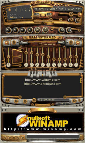
Unison Brainstormed v5
Featured Skin, May 8, 2001.Enjoy Another "Euphorbia Trigona" Release. Hope you like it...
Marek Wojtal
| September 17, 2005 by Nullsoft Classicz | 406804 downloads |

Staff review
Wow... this is a very well designed skin...It looks like some crazy invention that was far ahead of it's time. It has that old look to it... especially with the choice of colors... like a steam driven device or something. The level of detail is amazing... and the EQ is perfect. The gauge readout is such a nice touch. Great skin.
Original Design by Marek Wojtal.
Inscribed play buttons-console by Guillaume Carrier
WA5 update by Luigi Hann.
Original author's website:
Euphorbia Trigona Forge.
Comments
I would love to see your work applied to the Vending Machines in BioShock because this design is awesome! It makes me want to take out my Hack Tool! - February 18, 2011 by Beth
antideluvian and lovely - Nice JOb! - March 9, 2008 by BJ Wheeler
great - This is the single greatest skin for winamp, it's anachro tech feel, and steampunk style is really nice, and I couldn't ask for a better one. Good job! - August 27, 2007 by Matt Rachansky
Great \o - I love complete skins like this or 'the silence', they bring life into your winamp interface. Well done, 5 stars :f - August 23, 2007 by Abi S.
like something out of a h. g. wells novel... - i really do love this skin, but the doohickeys in the playlist really do need some tooltips, as my memory sucks - especially when the "save playlist" button's right next to the "clear playlist" button... - August 6, 2006 by timmy chemp
Titan - hey , this skin is better than i have seen ever , its , desigen , buttons n color is a combination of perfect skin , so , i have rated it 5stars , n plzzz dont keep it on first page of winamp.com for previwe. - May 1, 2006 by rajiv khandagale
really damn good - wow, it's great. i like the idea of this. an old machine, like a crazy invention. a lot of details, and also intentionally the idea that some lights don't function because it's so old and handmade. crazy stuff. - October 24, 2005 by Paul Popowiczyk
good - not bad, not bad :) good ?????????? :) - October 14, 2005 by Alex Kulon
Unison Brainstormed v5 - This is simply great. I like this style very much ;-) - September 21, 2005 by R�diger Falkenstein
i hate fumbling around for the play button - this skin has potential, but it looks to me as it's not taken to it's full. it has some very original details built into it, but it also lacks one that i absolutely require for any skin i use - labeled buttons - and i mean that in the broadest sense possible - an identification system of some sort. not just some light bulbs that look all the same and blink stupidly at me while looking pretty - i hate fumbling around for the play button. yes, i know, it's the second from the left, but memorising an interface kinda defies it's purpose, don't you think? i also hate mistaking "save playlist" for "load playlist". oh yes, there are tooltips, but only for some buttons, and checking before pressing each button is not my ideea of an usable interface. >:P there were some classic skins with much better looks than this one, which i never used because i hate not knowing instantly which button does what. - September 20, 2005 by Sam T
Yeah... i like it but... - there's a stupid little little thing: the repeat button, the light doesn't turn on, and the playlist buttons: i want to add something and i delete all :( - September 19, 2005 by jOsSse Cores

 Home
Home
