Underworld Evolution
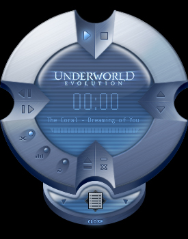
Underworld Evolution movie based theme.
Underworld Evolution movie based theme.Whether you?re a Vampire or a Lycan, you won?t be seen dead without this Underworld Evolution WinAmp skin!
I confess, this is only my second attempt at skinning and I take my hat off to the gurus around here who can whip the Llama?s ass time and again.
Hope I didn?t make any boo-boos ? I?m sure you?ll let me know if I have.
Enjoy!
| September 18, 2005 by Dutchtilt Desktops | 247637 downloads |

Staff review
The underworld is evolving ! Or something...This skin is without any major flaws, the design is nice (though not very exciting) and there are some nice touches. It's not great, but it's a good skin that does its job very well.
Comments
i love the movie i love kate beckinsale - i love kate beckinsale in skin tight suit she wears in the movie - March 1, 2009 by michelle kincaid
Speechless! V^^V - LOOOOOOOOOOVE IT!! - October 22, 2008 by Rhonda Melton
Its awsome! - this design is very sexy...im loving it....takes a bit for a new user to get used to...but at the end of the day the design is awesome and stylee! cheers to who ever made it.BRAVO! - December 27, 2005 by Nathalie Rangiwai
Good movie... - I'm a big fan of the original Underworld movie, and am really looking forward to the new movie. So when I saw this skin, I had to get it... It's a very beautiful skin. But...it doesn't seem very functional. No pause button is a big deal. And no volume indicator... It just doesn't function that well. And while it's beautiful, the style seems a bit off for the movie; at least, the first one. But that's just my opinion. - November 26, 2005 by Neard Burkhalter
Nice - It was good but you could of made it get smaller cuz its kinda bulky and i like how the thinger fits to the bottom and i like the shape its got that nice smooth look that makes you want it as a necklace....and wheres the pause button - October 20, 2005 by Ashen Vendatro
polya - It is very impresive - October 14, 2005 by polia ivanova
average - it's not an ugly skin, but - 1. i don't like skins which scatter the play buttons arund the whole surface of the skin, forcing the user to quest for them... 2. i like small, compact skins 3. too much wasted space. if it's a big skin, it better have some impressive eye-candy to throw around. this one doesn't. 4. it has some nice touches, the light and the buttons look nice and the colors go well together. - September 20, 2005 by Sam T
Suprisingly good... - I was actually quite pleased with this skin. My only suggestion is I would like to see more color schemes. - September 19, 2005 by Jeremy Stroud

 Home
Home
