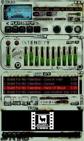
TRiO CS1570 _RSTD_
TRiO Osciloscope
TRiO Osciloscope[ Dedicated to my father, who took the pictures i used to make this skin ]
Well this is my second skin published on this site, i hope some of you like it and i would really apreciate it if you guys leave me some comments just to see what are the things i can improve and do better on my next skin.
Thanks to everyone who downloads this skin and everybody who comments. I need feedback!!
| October 29, 2005 by JuaNN Vendramin | 280547 downloads |

Staff review
Looks old, stained and misused for many years, but it actually works quite well to play your favorite music.
Comments
1 - November 18, 2010 by Alexandr Shoff
Awesomeness - My default skin now , thank you! - October 10, 2009 by Michael A Cosma
pure awesomenes - I think I found my new fav skin!!! This one is sooo wicked :D - September 12, 2009 by Hiena88
Urban Classic - Pefect,only seek bar miss.I use it every day.I like the equalizer. - July 25, 2007 by ILAIN DIMITROV
well done! - That looks quite well! Made a good job. - June 26, 2007 by ichabod tuman
OMG! - This has to be one fo the coolest, classic industrial skins I have seen (Thinkin' Skinny Puppy, Ministry, FLA, Front 242, etc.). LOVE THIS! Definitely 5*'s from me... also, brilliant touch in the personable photography from your dad you added to this... most unique and makes it a definite artistic winner! ^.^ - January 9, 2007 by Kellyann Malkowski
ARTISTIC & VINTAGE!!! :o) - ~*~*~Thank you Juann, for a wonderful winamp skin..I really love it! It has a wonderful vintage mood..and is also artistic and imaginative. It has a scruffy beauty...which I love. It's full of charm and character...something which many of them..although they may be well designed, sometimes lack. Well done...hope you continue with your artwork and creativity in lots of ways..and enjoy doing it. take care... :o)[email protected]. ~*~*~*~ - January 5, 2007 by milli bit
Best skin I've seen but... - Theres no seek bar. It's a pretty basic function and by adding that would make this skin complete - November 19, 2006 by Sami K
Good Job - I really like this skin. I can see a lot of work in here and, as I can read, even including some photographing. It's really great, but the only thing that could be better is color of fonts (which is the easiest to fix anyway:). - July 24, 2006 by Pawel Ignasiak
Beautiful Smudge - This retro skin gives me hope for the future. Thanks for making it. I love its \"reamed out\" look. It\'s impossible to find a working piece of machinery that looks like this in real life-- which is why it\'s GREAT that you made it look like you did in all it\'s ugly glory. Let that freak flag fly! - March 6, 2006 by dave cedillo
Woooow - THE coolest skin I have ever seen! Continue doing this stuff man. - January 17, 2006 by Pelle Moj
Nice modern-ruin feel - Very post-apocalyptic chic, looks like something you'd find in a long-abandoned nuclear silo from the 1960s. The fake serial number just adds to the charm. - January 14, 2006 by Jim Heckel
Always the ML button! - Why is it that every time I run into a skin I feel like using it misses the medialibrary button! I'd add that one and get rid of the fake buttons that are just for looks anyway, they usually give the impression of a feature being broken rather than a nice visual touch. Otherwise very nice job! - January 3, 2006 by Crispy Bacon
Perfect Grunge! - Fan-tabulous! (Fantastic and Fabulous, best of both worlds!) This skin is THE perfect grunge skin today. The faded text and old-server-style lines and text just add the the "UMPH" that this recipe. It really kicks the flavour up a notch! Hands down, best grunge old-style skin. Way to be one of the originals using photos to achieve awesomeness! ~Justin - December 16, 2005 by Justin Bull
Wow! - This is one of *the best* skins I've ever come across. Love the idea of using photographs for a skin as well, that's very clever. 5 stars. - November 21, 2005 by Aaron Boswell
Charming, but.. - I felt very joyful finding this skin, it's absolutely charming, but!.. There's no line, which displays song's progress (running cursor to pick on any place of the song). Or i just can't find it? If not, can you improve this skin, exactly? It's too nice. - November 3, 2005 by absent L
Dirty Genius!!! - The nastiest classic skin ever....I love it - November 1, 2005 by Vertice Venom
Excellent skin - Personally, I always go for the compact, crisp, functional skins. This skin looks superb, and the functionality has not been compromised in the slightest. The little blue display really works well. I can't really suggest anything to make it better, I'm glad you didn't use transparency, as a lot of people may have been tempted. Keep up the good work. Also... What I forgot to mention was that it might have been cool to extend the blue screen into the playlist. It might have suited it well. Anywhoo, top work :) - October 30, 2005 by Tim E
rust in peace - great looking skin, reminds me of an old rusty com radio from the 30?s. only bad thing is I can't find a search bar, other than that: whei! =D - October 29, 2005 by mattias nilsson

 Home
Home
