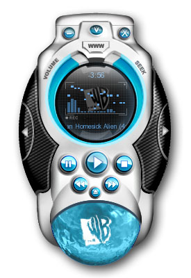
The WB Winamp 5 Skin
Keep up with what's happening on your favorite network!
Keep up with what's happening on your favorite network!The WB Winamp 5.03 Skin brings you even closer to your favorite programs on The Frog! Download the new WB skin and you?ll have VIP access right from the skin to the freshest gossip and information on shows like Summerland, Charmed, Smallville, Everwood and more. You are always just a click away from the hottest faces on TV. Be sure to check out the changeable color modes and cool liquid visualizer at the bottom of the skin. This one is a keeper. Built for Winamp by Petrol Designs.
Download skin| May 18, 2004 by The WB | 800098 downloads |

Staff review
A great way to track your favorite shows.The season may be ending but that is no excuse to let your favorite shows slip from your mind. Keep up with them by using this skin.
Comments
A Remote Control To Warner Brothers - What's Up Doc?I Think It's Pretty Awesome, Especially With The WB Liquid Part At The Bottom. Way To GO!By The Way My Favourite Looney Tunes Cartoon Character Is BUGS BUNNY! - October 5, 2007 by Joshua Wells
jorji - hello - January 5, 2005 by asghar radesh
Meh - Pretty cool. i like the water effect, could be done a little better i suppose. - August 30, 2004 by Neil Taylor
It's okay... - Well, this one is okay, but I do have a few problems with it. Though it looks good, the edges ARE a little rough, which isn't a big deal, but it's all in the details. I like how the buttons are all easily visible, but I don't care much for that water thingy at the bottom. At first I though it was a sort of visualization, but it does the same thing all the time, no matter what the music does. One thing that annoyed me was the fact that every time I activate WimAmp with this skin, it asks me for my time zone. What really annoys me about this is that though they have the usual Eastern, Central, and Pacific zones, the idiots left-out Mountain time. There ARE people living here in the mountains, you know! - June 20, 2004 by Tom Hamilton
I like this Winamp just because... - I like this because it looks so cool, especially in the red color, but I haven't figured out yet how to work the volume. Can someone help me on that? I click on volume but nothing happens. What am I doing wrong? Otherwise, I love the look and everything. Shiva - June 8, 2004 by Shiva Smith
lost - well i like it..although why is it that whenever i download a skin, none of them will work!? i set it as the skin and nothing happens, it\'s still the plain winamp one..help please? - June 5, 2004 by Cerian Price
was - was - June 3, 2004 by Denis Zehnle
bleh - cross promotion is legitimate. Nobody forces you to use it so I don\'t understand why people are complaining about it so much. I\'d actually give this skin 3.5 stars but it\'s not possible. - June 3, 2004 by 883 [breed]
-- KILLER GRFX -- Way to go! - This skin is all kinds of cool. I have enjoyed the WB skins that they have done. LEX is my favorite. that one is sweet too. Keep them coming. How about one for the hotties on One Tree HILL. YUM! - June 1, 2004 by Bobby Field
Oh, goody -- more cross-marketing! - If you all could see me, I'd be rolling my eyes. What, might I ask, does experiencing music and video on Winamp have to do with the WB? I'll tell you -- NOTHING AT ALL. This is worse than that Hulk/NBA Basketball/Mountain Dew crossover last year. A note to the people who do this stuff: STOP, for the love of whatever diety you hold near your sick and twisted hearts. Geez... - May 30, 2004 by Mike Hemmerling
Is it laying an egg or something? - I just don't get that wierd thing on the bottom, in general it's too bulky and the highlighting/shadows are wildly inconsistent. - May 28, 2004 by Pete Clark
horendous - I'm sorry but this skin just looks God-awful. The edges are just so rough and jagged, the shading and hilights just don't work for me... all of the vis bars are un-equalateral. the time and song ticker text just looks ugly.. the buttons look pretty bad as do their surroundings, and the left/right drawer open buttons and "carbon fiber" and disturbing. On the plus side...uh...I like the 'volume' and 'seek' text. it also fashions a 'thinger', I thought people decided to trash them for W5? I may be a little rough on this skin and I'm sorry for that, but...this just doesn't do it for me at all. - May 28, 2004 by Dan Wenner
Could be better - Likes: -the lateral eq and thinger. -shade mode (just OK). Dislikes: -the browser always asking for your time zone every once you open winamp or change the skin, even when you are not from US. -the blue globe viz that only stops (or starts) with a mouse click. -the "Homer" design.(DOH) -the few color themes that dont match with the skin itself. - May 21, 2004 by EAN13 UPC
What god thinks - Godamnit! What's wrong with you people? Why is this "bulky" design so popular when it looks like cat-crap. Sleek design won't change the fact that this sucka' is more outa' shape than my fat ol' dad, and it gives the skin an commersial aftertaste). But i'm really impressed by the WB's logo. - May 20, 2004 by Peter Manning
Bueno pero... - Este skin es bueno pero deberia tener mas temas visuales... ?? - May 19, 2004 by Carlos Salas

 Home
Home
