Styx
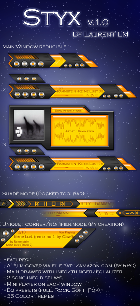
New skin with cool features : cover, IDtag, equalizer in the main window, ?notifier? mode, toolbar
New skin with cool features : cover, IDtag, equalizer in the main window, ?notifier? mode, toolbarIn Greek mythology, Styx is the name of a river which formed the boundary between earth and the underworld, Hades.
Today, several real rivers, an american rock band, and, now, a Winamp skin are called Styx.
Styx is my 3rd skin, and the most complete :
- info, thinger, eq and cover art in the main window drawer
- cover art by R. Peter Clark via file path & amazon.com
- 2 info tag displays
- 4 eq presets
- 3 skin modes
- unique : corner/notifier mode
- repeat all/track
- config window
- buttons easy to see
- fullscreen button on ML & AVS frame
- 35 color themes
Enjoy !
Thanks in advance for your reviews.
| September 20, 2006 by Laurent L.M. | 118361 downloads |

Staff review
Wow, this is a sharp design and no mistake, I love the various modes you have going on, although I would have liked to have seen it change layout when dragging to different corners of the screen.
Comments
Interesting .. - NiceMatches My Theme ^_^ - March 30, 2008 by Anthony Marfilio
Nice work! - I spent a lot of time ripping my large CD collection and encoding the album images in the files, so this is a great player for me! I would like to see the album covers on the Winamp Library screen as well - possibly a future release?Thanks for the great work! - June 6, 2007 by Gary Eckhardt
Awesome Skin!!! - I just love this skin!!! It fits perfectly with my desktop, and the notifier mode is unique and awesome as well. The only drawback is that in this mode the song info doesn't display, so I have to constantly change modes for I can see it every time. Anyway great skin I'd give a 6/5 if this get fixed on the next version. Finally the colors are great, just add some more and it will rock 100%!! - March 2, 2007 by SoulStream HX
Style is great! Positioning... needs work - The skin is terrific... except for one thing that has driven me nuts. The skin does not remember the positioning of the main window, the media list, and probably something else. This alone makes me frustrated with the skin. I spend a couple minutes getting it just where I want it, all the windows docked where I want them. Then I close Winamp, open it back up, and the main window (I have it in shade-mode) defaultsback to the upper left corner of the screen. ARG! Troubleshoot this issue, re-release this skin, and it will get a 5 of 5 in my book! -Syn - January 27, 2007 by Syn Man
Broken - I Really love the look of this skin accept it seems to crash my winamp, just wish i could use it, if anyone would no a reason why pls email me at [email protected] - December 18, 2006 by Rich Wild
Very nice - Quite striking as well as handy. - December 6, 2006 by Oleg Kio
Wish there were more colors... but... - First wish: I wish there were more neutral/gentle colors to this. It looks like some sort of rocket ship fin, which doesn't quite appeal to me. The overall design isn't as "pleasant" as my other skins. However, I adore the shade mode and the super cool corner/notifier mode. Also, that "song information" drawer is pretty sweet. Second wish... instead of a song "information" drawer, I'd rather have that last button open the PL editor, leave the album cover art where it is, and replace the song-information with the playlist info... if you could swing that, it would make this a SIX star skin (for me, at least). Amazing anyway. - November 25, 2006 by Jessica Tok
This is the best skin out there by far - I love that style and the idea that I can see all as much of the ID3 tag that does show. Less would not be good and more would be too much. How this skin is designed is perfect and can't wait to see what you come up with next. I just hope that you keep your Song Information window just like it is (info wise). Great work!!! - November 7, 2006 by Jesse Wilson
Awesome - This is what skins should look like. Well at least what they should contain. I really like being able to see the CD sleeve & all the information about the song (album, year of release, track number, etc.) I hope to find more skins created with this amount of info (ID3 tags). - October 30, 2006 by Jesse Wilson
yeah ! - I love your style.... my new skin for a time ;) very good work - September 23, 2006 by Ben SisTeck

 Home
Home
