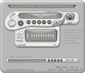
Simple_Amp_
Featured Skin, April 24, 2003.its simple..and, ummm...amp! This is my first winamp skin. I wanted something that was easy to use, and at the same time nice to look at. What do you think?
Graphics: Gavin Sim
Coding: Jared Kole (iPlayTheSpoons)
Download skin| May 3, 2003 by Gavin Sim | 238057 downloads |

Staff review
Style has a new nameVery neat compact skin that hides a lot of features. Lot's of colour themes to play with, minimal mode, built in EQ and thinger, very stylish.
Comments
nice - ..cool looking. make the font a LITTLE bit easier to read... it's pretty clear already but maybe make it just a little clearer? - October 8, 2003 by kko n
Good, but ugly. - It's a very useful skin, but the color themes are rather unattractive, and some even make the menus totally illegible. I like skins that are small and look good. It's a decent skin, and if the author plays with the color a bit, it could very well be great. - September 21, 2003 by Dante _
Very very nice! - Very nice! stylish design, user friendly, and, best of all, looks good on your desktop. There is one little flaw. The main window don't really fuse with player editor, but that can be overlooked! - August 30, 2003 by amelia Bennett
sweet - very nice love it small and easy to use should be a bit better graphic design but all up nice - August 15, 2003 by Mark Zippa
Groovy! - Like the stick mode, but agree w/Planet Abyss, the windows are too bubbly for the stick mode, wish more skins took devay's idea w/skinned windows that collapse... - June 20, 2003 by David May
Nice. - Very nice. Could use many more color themes to choose from... but fits nicely on a desktop and is intuitive for use. Thanks for the skin :) - June 15, 2003 by arikamu ji
simple-amp - Diculpen no saber ingles pero me parece muy bueno este skins aunque tengo algunos problemas para bajarlos saludos atodos y hasta pronto - June 1, 2003 by ariel peredo
Almost - This almost got 5 stars. Why only 4? The windows have this funky thick border. It works but it isn't my favorite... - May 6, 2003 by Planet Abyss
Simple _Amp_ - SPPOX - May 4, 2003 by Stefan Batory
I cannot change my skip of winamp! - I have downloaded the skin and extracted it to direction of skin of of winamp.But I still cannot change my skip of winamp! Why? - May 1, 2003 by zlm ym
2nd Best Skin Ever - I love it ... complex design, yet with a nice narrow version. - April 30, 2003 by Noah Juergenson
Ok, I believe you... - Gavin Sim said: ============================== its simple..and, ummm...amp! This is my first winamp skin. I wanted something that was easy to use, and at the same time nice to look at. What do you think? Graphics: Gavin Sim ================================ I do believe you: Easy to use AND minimal use of curves makes a very neat and stylish player. However, a tiny problem I have is how the square shaped plalist window docks with the curvy main control window. Well, maybe I'm asking too much... Well done! - April 30, 2003 by nchua Chua
ok - its ok - April 25, 2003 by saagwaan mujtaba
no comment - no comment - April 21, 2003 by Razvan Nesa
Main window & Winshade look good, but not the rest - I've used the beta-version of this skin, about a month back, and I like the design of the main player window, volume control & the cool winshade mode. I also like the EQ & Thinger slide-out drawers; but what really pisses me off is the design of the component windows: the borders are way too thick, too much space allocated for the window-title & they end up occupying much more space than the main player window itself! The full version is not any different from the beta. - April 10, 2003 by Prashanth Srinivasan
What is there to say? - Its awsome ;) - April 10, 2003 by Jared Kole
work on like this - its a really nice thing you made there. i like those skins that are not too big and got all the features you need by the hand ...very good work i think !!go on!! - April 10, 2003 by Conrad Clau?

 Home
Home
