ShinyClassic
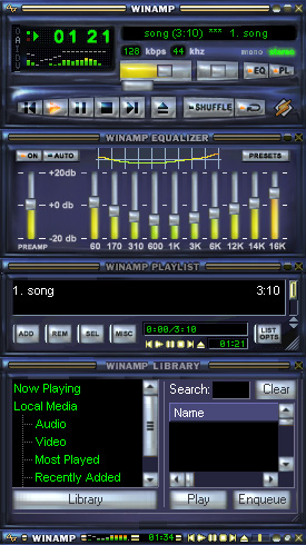
This is my 1st skin. A shiny chrome update to the original classic coloured skin.
This is my 1st skin. A shiny chrome update to the original classic coloured skin.This is my learner's training skin - A homage to the winamp classic skin, in its original colour scheme with a buffed chome finish and contoured buttons to update the look.
Download skin| April 6, 2005 by Leigh Malpas | 140054 downloads |

Staff review
ShinyA shiny version of the classic skin
Comments
Not Bad - Makes The Classic Skin More Good Looking If You Ask Me. - October 16, 2008 by Joshua Wells
Just my thoughs... - I'm just AMAZED on the staff and Benjamen Brown comments... The Most and Wonderfull Artworks in the world are based on IMITATE something good or not very good... but I realize that everyone doesn't think like me, but I just have to say to the staff guys: Open your minds and see through this skin a bit deeper than your exhausted minds(though) are able to see and rate this skin better... - June 22, 2007 by Rodrigo Perez
:D - Wow! Great! It's really shiny. It's more enjoyable than the dull classic one -> - May 30, 2006 by Sebastien Villeneuve
very good - Esy to use...easy to understand and to found buttons!! Very well done!! The best way to use winamp! - March 9, 2006 by Faby Ben
Good - Very Nice ;) - February 23, 2006 by Cetin Caliskan
ShinyClassic - I like this design a lot. It is playfull and the buttons are showing very clear. It would have been a 5 star verdict on my account if the text wasn't so thick on the blur. I hope to see that improved on the next version. Keep it up! - July 23, 2005 by Frank Houthuys
Cool - I can't believe staff gave you such a low score. They probably didn't like being shown that their skin can be improved. Good work. - June 27, 2005 by Arch Angel
Very Cool - I've always liked the classic skin of Winamp, but this is the same more brilliant. I love it. I would like to have a translation into Spanish. - May 31, 2005 by Antonio Garcia
drummer bob - i'am truly suprised this has'nt been done before . but regardless , this is an awsome version of the classic skin , its the touch it needed - May 17, 2005 by robert somers
Shiny Classic - ? ?????? ???????? ??? ??????????? ??, ??? ????????? ?????? (??? ????) ??????????? ????????????? ????, ? ??????: 1) ??????? ????? ??????????? ? ??????? ????; 2) ????????????? ? ??????????? ???? ?????? ?????. - May 16, 2005 by Dmitri Vorontsov
Hot en criss!! - Good job Leigh - May 9, 2005 by Kevin Lemoure
Just 2 stars from Staff? - I find this skin quite good, I really like that shiny style :-) - April 18, 2005 by David Pozo Navarro
Good Job - I like it a lot. It gives the boring classic skin a shiny cool look. Staff, it deserves a better grade. **** - April 14, 2005 by Ozzie Aguilera
bla - its better than classic, but I am giving it a low grade because you basically just worked off of other peoples skins (in this case the winamp staff) - April 14, 2005 by Benjamen Brown
Naughty Staff - This skin looks great, I don't know why the staff review is so against it. This guy has made the classic skin better, just accept that a newbie has made your skin better :) - April 10, 2005 by Tim E
Brilliant! - It looks fantastic, I wouldn't say its better than the classic skin but still, a good skin - April 10, 2005 by Paul Su
ShinyClassic - Its awesome, and shiny. - April 10, 2005 by Brandon purvis
ShinyClassic - I like this design for the classic skin. It has a really sharp look to it and I love the 3-dimensional controls in silver, etc. Like to see more from this person. Keep on learning and give us some more skins. - April 8, 2005 by Eugene Edwards
Very good, skin I like it. - CooL :) - April 8, 2005 by Boozis Woozis

 Home
Home
