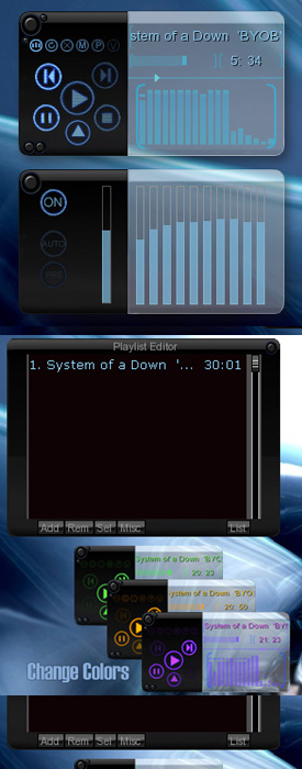
Resin
D
DResin by Skin Consortium
Getting you ready for Vista OS.
Resin takes you to the next level with
unique Glow Buttons and Glass Transparency.
Choose some nice Colors to match your
Background.
Code and Graphics Quadhelix
www.skinconsortium.com
coders needed
| March 5, 2007 by Skin Consortium | 93487 downloads |

Staff review
Neato looking skin, lots of functions.
Comments
I'd probably like it, if I could see it. - You can colour it to suit your desktop... if your desktop is black. Great idea, lacks a little in execution. I read in the dark a lot, so my eyes don't like this skin, or me for persevering with it. - May 24, 2007 by THUD~* Munkki
Great Neon skin - I love it i use the Red color for my red on black pc theme. Please make a version with totaly black background and the transparent part dark black transparent (this is too light for dark themes) and as everyone says the buttons should light up all the time but also have another glow efect when mouse over (the mouse over efect is important so keep that) Please keep updating this skin it will be a Excelent skin with time but still now is great. - April 9, 2007 by ragnarok gashi
perfect - Just registered to thank the SkinConsortium for their unveliable (and free) work. I love this skin. It´s perfect. All functions in a hand, neat & tidy, modern&good-looking, easy to integer in a job environment. This skin its gonna make win amp my default media player. Ultracool. Simply perfect for me. Thanks. - April 4, 2007 by Pab RC
Not bad - It`s an interesting and unique design, but still, there is much room for improvement, for exemple the control buttons should be highlighted a bit even if you don`t hover on them cuz this way it`s a bit hard to use, but above all this it`s a good skin - March 27, 2007 by Tibi Ardelean
like it.got some suggestions. - I really like it. But couple of things could be better. First of all in playlist song currently playing should be better highlighted, on most color schemes you can't see it Second thing that would be better is in playlist:to display total playing time of the playlist. Third thing (hopefully it's possible to do) is extending transparency to other windows especially playlist editor. It would be cool if background of playlist editor could be made transparent. Another thing current design could be upgraded by adding different modes , for example 2.mode could be made half the height double the lenght making it leaner, and so on. Hopefully these suggestions will be taken in in account in next versions of this skin - March 13, 2007 by Domagoj Batinic
Hmmm - Not a bad skin, the glow button effect is nice and so are the color schemes but the only thing that doesn't appeal to me is the actual design, still who am i too criticize I don\'t know how you create skins haha - March 8, 2007 by Nick Zammit

 Home
Home
