RecApod
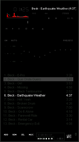
Very nice and stylish skin. Basic colors
Very nice and stylish skin. Basic colors - red and black.Cool skin. The thing that distinguishes it from the others is a very stylish simplicity. Enjoy it!
Download skin| December 29, 2006 by Vladimir Strugov | 69027 downloads |

Staff review
wow, that's about as simple as it comes for classic skins!
Comments
Classic - I loved the overall look and aesthetics of this skin. However, I wish the controls /fonts were about 20% brighter. Also, I would love to see another version with green instead of red in the spectrum analyzer section. But, overall, this is one of my all time fave skins. Great work! Hartej - March 17, 2009 by Hartej Singh
Very dark - Very dark, but I like it. I've been looking for a true black skin, and now I've found it. Very nice dark theme, and I like the red visualization changes. Buttons and equalizer's are hard to see, but if you're an avid Winamp user, you should have no problem. 5 stars from me. - April 1, 2007 by Apollyon Holton
Very Nice - Best plain black skin Ive ever seen... Im a classic winamp whore, and lost my old favorite plain one... This is an even better replacement. - March 14, 2007 by Syndelle Aribinthe
WTF!! - i cant see a shit!! the playlist is lame... - January 9, 2007 by jOsSse Cores
sleek - the best black skin i've seen so far. - January 7, 2007 by Matija L.
Nah - "Simple" is one thing, but this seems lacking in effort and style. So much solid black... any more and there wouldn't be a skin at all... - December 31, 2006 by Luigi Hann

 Home
Home
