QL2
A Professional Look
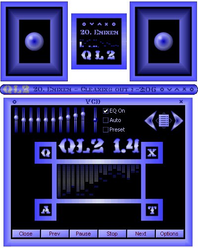
A Professional LookLots of Maki's. Clock, Volume Mute and VU meter.. The meter measures the audio level pre or post volume control setting. 10 EQ presets on the Equalizer. Several colors to choose from.
Download skin| May 19, 2003 by Aniel SHRI | 304904 downloads |

Staff review
I like this,I like this very much, and that's why you got yourself a 5 star skin. :)
Comments
This skin is hideous - what is wrong with you people? I guess there's no accounting for taste, but this skin is downright UGLY. I don't understand why this is one of the top rated. - February 13, 2007 by bacon mcgee
The only thing that...... - would make this skin better is popup descriptions when you move the cursor over the symbols. It still gets five stars from me though because once I figured out all of the functions I was hooked on it. - July 13, 2006 by Jack Sanders
Cool - I thought this skin was awsome , but could you do somthing in a magenta pink. It would look so good with the black! Thanks! - March 4, 2006 by Nessa Cooke
awesome - awesome awesome awesome Can you tell I REALLY like this skin? - June 28, 2004 by Korinne Brown
love it - i just love it - April 17, 2004 by paz alvarez
Not bad at all - Simple and effective. Very good shade mode. Very good help. Design could be improved, though. All together - well earned 4 stars. - January 28, 2004 by Djordje Trifunovic
QL2 R@Ting? - Its a k0_ol coller pretty good - December 20, 2003 by HL_CS_CZ HL_CS_CZ2
Zayebisty skin - It's my favorite skin.Those colors are BEAUTYFULL!!!!!!!!!!!!!!!!!!!!!!!!!!!!!! - October 28, 2003 by Maciek Chmielniak
Not bad - Not a bad skin at all but reminds me of a 1970's sprayed stereo owned by my dad, try and bring it more modern mate you may be onto something then - October 21, 2003 by Andrew Whalley
cool - cool skin, love how the skin is animated but it does take a little learning - October 7, 2003 by cobalt dragon
This is my favorite - I just love this skin. The color blue is my favorite. I like how easy it is to get to know it. I have it on my Winamp right now. Thanks for the fun - October 6, 2003 by Ronda Keasler-Ford
www.fdr.at.tt "Quite Boring" - Same Old Same Old.. - September 16, 2003 by fdr -at-tt
Seen better - Gotta say , original but get a newer style to it - August 9, 2003 by K. L.
now we gonna partay like in 1991! - OW! the crazy bright neon colors are hurting my eyes! I thought people stopped using these colors on computers after they broke out of the 16-color world back in 91. Also theres too many squares. My computer is already a square, and my desktop is in the shape of a square, and then I open winamp, and then there's about five billion squares in my face! its a little too much for me, sorry. I give it 2 stars because it works. - July 31, 2003 by rach jo
Actually.. - Its not as bad as I thought it would be. The picture didnt seem very appealing to me, and I wondered why it got a perfect.... So I checked it out. I like it, but its too.. boxy.. - June 12, 2003 by Brian Hill
2k - Too squarish - June 9, 2003 by Sandy Lee
Hmmmmmm - I do not like the animations on the advanced EQ or whatever it is called. I do like the help file though. And I do like the blue coloring (who said purple?) it is a bit bright, but it isn't too bright, it doesn't hurt my eyes. The skin takes up a lot of space with the extra things you've added to jazz it up, but for someone who doesn't mind & wants their desktop to have something that matches their wallpaper so their geek friends can "Ooooh" and "Ahhh" over it, this is nice. - May 30, 2003 by Miss Deceptions
Well Done - At first i didnt think it was anything special, but i have grown to like it alot! - February 24, 2003 by Harry Singh

 Home
Home
