Proyections
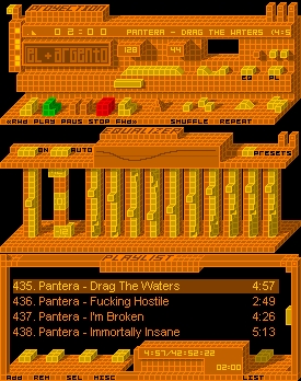
Skin based on a perspective technique
Skin based on a perspective techniqueThis is based on a perspective technique that I learn at university
completelly made in paint
enjoy :)
| July 30, 2006 by El-ArGeNtO (Fernando Adorneti) | 146755 downloads |

Staff review
Wow, this is amazing, all done in paint you say?, the perspective is fantastic, really adds depth to the skin, great inventive skin.
Comments
Reminds me of Zaxxon :P - November 22, 2010 by Giovanni Leanza
very nice - woot - March 9, 2007 by Sean Burton
Original and beautiful - This is my favorite classic skin. All parts of it are perfect. Not all skins label the buttons and this one does when the mouse hovers. I haven't found a more perfect skin in either classic or modern. - December 10, 2006 by elle pitt
Demais!!! - Muito legal o efeito que o autor do skin fez com os cubinhos... D? uma aparencia 3d no winamp. A anima??o quando voc? meche nos bot?es tbm ficou muito boa! Simplesmente demais! - August 28, 2006 by Filipe Mondaini
Am I in the fourth dimension? - Wow. Looks sweet. And retro, too. If you made a blue version, it would look like something from the 30th century. - August 27, 2006 by Stefan Rosic
Awesome - Nice looking skin, not overly advanced and the colours are easy on the eyes. Most good skins make it hard to figure out what button does what but the labeling here is great. Plus the screen shot features my favourite band, rock on! - August 27, 2006 by Andrew Schmidt
Dear God! - This is an amazing skin! Awesome use of isometrics and transparency. - August 26, 2006 by Matthew Balousek
great- but orange? - Alright, i don't really have anything against orange, in fact I like it somewhat, but I think this skin would be ten times better with different color presets. Obviously, we cant do that with classic skins. on the other hand, this skin is definetly one of my favorites, because it is retro, simple, subtle, well - animated, and has the signature look of commander keen (the best computer game ever). ***** - August 26, 2006 by Aaron Duke
Phah! - Kool! - August 13, 2006 by Stoycho Ganev
El*Argento's Best Yet - This skin falls in a category of classic skins experimenting with 3d effects and transparency. Precedents include Kuki's two "CUBE" skins, Ryan's "Blocks" and "Checkered", and Hameista F's "ArchiAmp." "Proyjections" is El*Argento's greatest skin yet, earlier skins showing all the elements of experimentation but, arguably, without much aesthetic appeal. Vector based graphics recall electronica album cover art from the late 1990s on the Warp and Dot labels. - August 12, 2006 by Aharon Varady
It's just so...lego. - The best skins in Winamp are typically the ones that can achieve tastefulness and originality...especially by taking such simple design concepts & tools and pushing the envelope. I'm not a fan of orange, but it works! Nice job...umm..El...or..Mister Argento. - August 1, 2006 by Alan Eh
MS Paint! - MS Paint!? What a powerfull program! Excellent work, very usable. Animations are great, as always. - July 31, 2006 by Veronica Mogni
Whoa... - This is the best thing made in Paint. - July 30, 2006 by Chance Freeman

 Home
Home
