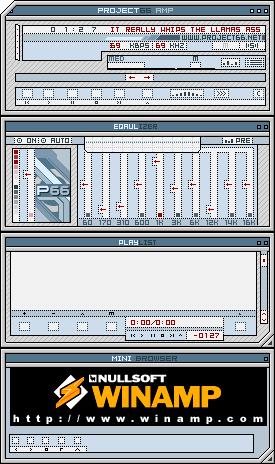
Project66 Amp
Took a long time
Took a long timeThis skin is compatible with 2.x/2.9 and goes beautifully with http://www.project66.net. Enjoy.
Download skin| April 19, 2003 by Basementman CochRan | 22725 downloads |

Staff review
Project66 AmpSoft colors, clear layout.
Comments
Has the staff gone blind? - I don't understand the Staff Rating for this skin. Maybe I just don't understand how it works or something, but it seems to me that this deserves a 5 for Originality, Completeness and Aesthetics. For originality, I know that I haven't seen another skin that looked like this. I'm pretty sure the author created the layout for http://www.project66.net and it seems he made this skin. How is this not original? Not only is every window skinned (Including the AVS window.), but even the cursors are skinned. How is that not complete? As far as aesthetics are concerned, not only does the author maintain a uniform design with good use of color, but it compliments http://www.project66.net perfectly, just as the author claims. How is this not aesthetic? It seems that the staff really needs to start updating their reviews. Another important feature of this skin is the fact that it's not too cluttered or complicated. While I'm not saying that the author didn't put any effort into making this skin look nice (because it looks beautiful), it looks like he kept in mind that form should follow function (which is something many skinners seem to forget). In conclusion, I give Project66 Amp a perfect 5 out of 5 for being original, complete, aesthetic, clear and functional. Keep up the great work! - July 5, 2003 by Keith Fruge
Cool colors, smooth design. - Yeah, as Marc Tricou said, this is very good. I actually love to listen Linkin Park with it ;) - May 3, 2003 by Otto Sarvamaa
Wowee - This skin has a great subtle look to it, and it's only 24 kb! :O how can something that good be so small?! - April 29, 2003 by Luke B
How ugly - The name sais it all - April 29, 2003 by Daan Janssen
Flat and Great - It looks simple but really good!!! - April 28, 2003 by Brad Cain
Two thumbs up! - Nice and clean, I like it!!! - April 27, 2003 by Zarko Jovic
good stuff, nice design - I like it. cool thing. nice style AND (important) very good readable font. Also i lilke the colors. Quarc it! - April 26, 2003 by Marc Tricou
Great Job! - i like this skin! very complete. has a very nice design, clean and innovative. a keeper for sure. get busy downloading now! besides it's done in a snap! 24k only! :D - April 20, 2003 by bunji design
what? - i skinned everything including pointers, why did i only get 3.5 for completeness? - April 20, 2003 by Basementman CochRan

 Home
Home
