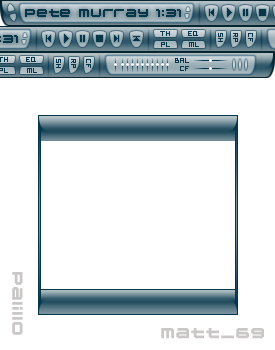
Palillo
All that sticky goodness.
All that sticky goodness.Palillo is a purposely made stick skin that fits nicely in you window titlebar. Made for the 2004 GUI Olympics but did not win anything. It comes with an inbuilt thinger and equalizer, full standard frame, a walkthrough plus all the rest you love.
Download skin| June 26, 2004 by Matt Adams | 231275 downloads |

Staff review
Get in line.Thank you for your submission
Comments
Great - Get this! - August 19, 2006 by josh subra
nice all-around - i've been using this one for a while. I like it because it doesn't lack any of the things i look for in a skin 1. It's compact 2. It's functional: well-chosen features and has clarity. 3. Looks nice without using cheap eye-candy. Good contrast, good color-choice. Only 4 stars - it's very close to perfection, but not quite there. What could be improved? > I guess it couldn't get more compact than this without losing lisibility, maybe more visual juice(Now it's ok, but not "smart" enough, can get a bit boring after a while, especially because of those many buttons using letters(TH, EQ, PL, ML, SH, RP, CF)) This skin is like a volvo - good car, but lacks the balls of a ferrari :P - July 1, 2005 by Sam T
S.S.D.D..!!(same style, different design) - Not bad, dude.. but considered g8 5 star, nice skin matt.. keep it cool dude..! - March 25, 2005 by Slay Spencer
Nice one - Just to say, love that skin. - March 11, 2005 by Hanz Mulkaler
excellent skinny skin - I neeed to be able to see my player all the time - to mute it when someone comes into the office :) and this one is perfect for fiting in the windows title bar - like the man said! - December 30, 2004 by Craig Barrow
Awesome but... - The Playlist editor's got a problem...when you have the skin stuck to the top of your screen, and have the playlist editor sticked*, the area it normally takes up, is still taken up, by a black box...dunno if anyone else had this prob, but it isnt useful to have a black box covering your browser...fix this issue, and I'll defenitley give it 5 stars. - December 14, 2004 by Ben Edwards
by Matt Adams - 4 - October 28, 2004 by Helena Zimackova
inspired - its nice.... however the playlist editors winshade mode is messed up (it turns to a black box the same size as it was before) i dont know if thats just me or what.... other than that... its nice. - October 10, 2004 by Ryan Blizzard
Gimme Volume - I downloaded this skin and I love the compact simple design. One thing I found the volume control to be rather cumbersome. Would rather have had the volume slider out in the open than the equalizer, which in some cases is not as important. Otherwise, a great skin. - June 29, 2004 by Michael Landa
slick - Excellent skin. New one on my computer. Would be nice to shorten the skin horizontally, but maybe that can be done in a future version :) - June 28, 2004 by arikamu ji
Amazing - Readable, elegant. Just what i need. cept, how to i make the main window a bit shorter? i don't need to always see a thinger or an equalizer. - June 27, 2004 by Greg van_Berkel

 Home
Home
