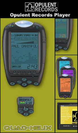
Opulent Records Player
By: Quad Helix
By: Quad HelixThis skin was designed by Winamp skin creator Quad-Helix. The focus for the skin was to deliver a meaningful new look to the #1 Media Player by which newcommers to Opulent Records Music downloads can enjoy great tunes and remember where they got them.
| April 18, 2004 by Jason Appleton | 241558 downloads |

Staff review
Looks way too much like that device I have to work with on a daily basis, my scanner.But anyway, a very good skin. My preferred theme would be the default 2 theme, as I can than see what I am pushing. Maybe my resolution is too dark?
Comments
Cool! - Winamp is my favorite player! :] - June 25, 2006 by Kate Shinoda
Interesting... - Whos idea was it to create a Hand-Held computer skin? It's hard to read and I guess if you were to take a look at a Hand-Held and look and the contrast they have, you may want to copy that, or make it into a full colour LCD rather than just the one. And WHAT IS that blob? It's funky looking! P.S. Uhhh.. i think you should stop listining to Paul Oakenfold... Heh heh heh... - July 23, 2005 by Justin Harper
ugly - OK layout and use, but whats with the blob on the top of the main window? - June 4, 2004 by Pascal Getreuer
Masterful Job - I personally fell in love with this skin after playing with the varied color schemes available. Quad-Helix did a msterful job on this. - April 30, 2004 by Jason Appleton
Worth developing further - Please lighten the colours to give better contrast. Exits with scripting errors, as with most WA3 skins which have not been updated for WA5. Worth developing further! - April 25, 2004 by Brian Reeves
he he - haha! kool! "hand -held skin!" lol keep up the good work -Mandy - April 22, 2004 by Mandy wettlaufen
Really good skin. - Really easy and simple skin to use. I like the ease of access to the menu, and colors, as well as the opacity feature. Cool Layout!! - April 19, 2004 by Giorgio Armani

 Home
Home
