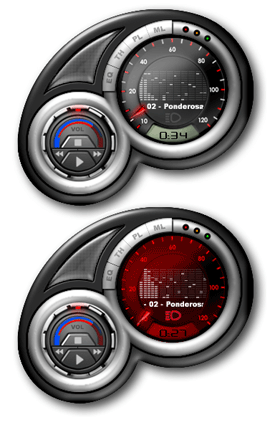
Official Honda Element Skin
User Interface and Coding by Petrol Designs.
User Interface and Coding by Petrol Designs.With its fearless shape and sturdy body, the Element was built to withstand the rigors of rugged, action-packed lifestyles. Its clamshell tailgate and center-opening cargo doors make for easy loading. A removable skylight comes standard with the 4WD models, for stargazing or wet-suit changing. This is a must have for your desktop with a new feature that switches the skin to night mode when your computer clock turns to 5pm. Check out the new Honda Element!
| January 13, 2003 by Petrol Designs | 423302 downloads |

Staff review
Sleek Car-like styling.The Honda Element skin emulates a car dashboard interface. Nice button placement and tiny windowshade mode. The night mode is unique and interesting. Makes you want to sit there and play with your Windows clock settings all day.
Comments
1 - November 19, 2010 by Alexandr Shoff
Looks good - Looks good but careful where you click or you end up opening a browser page for the Honda Element. Tried to move it and went to the web page,(more than once). This happens anytime you click near the speaker grill.Very irritating. - July 21, 2009 by Roger Blakley
cool - cool:))) - April 26, 2008 by Drakan setas666
this skin rocks - yo i'm a big honda fan, and this skin rocked me till my eye's bled they bled so much i swam in my own blood. congrats on makin a good skin oh and one more thing, FARTHER TIME "SUCK THESE NUTS" brand name skins don't suck dya hear - November 12, 2006 by mike button
Looks Great ~ Can't resize windows - Love the look of this skin, but for some reason, I can't drag the window size. Makes it a hard sell to want to use it when you can't see the media library. Ideas, anyone? - December 24, 2005 by chris johnson
good/bad - Impressive skin, gay car. I'm sorry but for an SUV, it's pretty gay. But hey, once again, I like the skin. Looks like you worked hard, and it paid off. - June 4, 2003 by Joel Leavelle
The Element? - Ugh. Hate the car, Love the skin. Could you try doing something more to the flavor of a Benz or a Ferrari? Overall great work tho, albeit an awful choice of car to model after - April 29, 2003 by Blake Muxo
got to make this better - That is one strange lookin curve with the button to the element site. I don't like that too much. The play, stop, etc. buttons don't look right. Besides that, it looks pretty cool. - April 8, 2003 by C H
Simple, kick-ass skin... - Well, I like Hondas, so I'm sorta biased. Good skin, has a clean look. C'mon, you know you want it, everyone's downloading it... - April 4, 2003 by Michael K.
Honda element - Why can't i download the element, it won't let me save it. What's wrong, please tell me what i should do, to save??????? - March 13, 2003 by Steen Dolmer
official honda element - its cool and unique style...... - February 15, 2003 by aura monica vicente
Commercialize THIS! - Brand name skins always SUCK! Unimaginative skins designed by marketing jags who embed their Dot.Com adverts all inside it! Does every office at Honda have this skin on their desktops??? NO BRAND NAME SKINS! Do you hear me, Fanta??? - February 14, 2003 by Father Time
good - good - February 1, 2003 by ?E?o ??
go honda go - Very original, but not very functional. I clicked two times by mistake on the carbon-looking triangle in the top-left side, which is a link to their web site, and then I decided do delete it. - January 21, 2003 by Daniel Ovidiu Andrei
PHHHHHHHHHHHH - This thing looks gay and made my puter crash like the Mondale. - January 21, 2003 by Brandberto Walshberger
Official Honda Element Skin - This is the best skin EVER - January 20, 2003 by Kevin Richards
Honda - It's Great - January 18, 2003 by Luis Serrano Ceballos
:D - great car, great skin. - January 17, 2003 by Stan Marsh
why is a title needed? - the honda element is soooo ugly... the skins aiight.... i'll give you a 5 cause im only dl'ing it now - January 15, 2003 by Dustin Flaterud
Looks great! - This skin is well designed. Looks awesome and love that night/day feature. Haven't noticed any bugs but there's one minor flaw, in my opinion. I don't like that triangle on the top left that hides the winamp when u press it. Quite annoying because the button is so big too. - January 14, 2003 by Tony Tsang

 Home
Home
