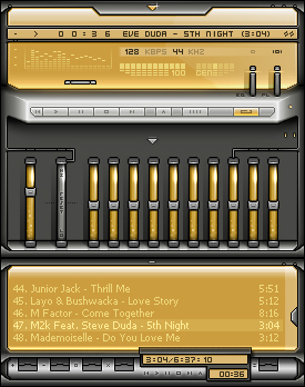
Octane v2
by bunjidesign
by bunjidesign*** New version ***
fixes & improvements:
1. The eq emptiness, which has been slightly improved by the thin metal tubes that hook onto the glass containers.
2. The blur effects on active playlist- and video-buttons. They are now much clearer.
3. The missing kbps/kHz text in the main window, along with bad mono gfx. This has also been fixed.
*** Original Readme ***
Octane, is a very nice looking skin that uses fore-, middle and background effectively.
I chose the silver/orange theme, because i get tired of the standard silver/blue.
besides the skin-title kindda had to match the look as well :)
Not much more else to say about it. hope you like it!
>bunji
| January 17, 2004 by bunji design | 263643 downloads |

Staff review
High octane Winamp skin.very good work. Good color choices.
Comments
cool - slik and smooth! its cool - February 6, 2004 by yoni a
octane - Good colors like real hi-fi systems should look like. - February 2, 2004 by roos marcel
Anyone up for a Fanta (TM) - Nice skin...All of a sudden I need and Orange Soda... - January 26, 2004 by Sean Hudson
Great Skin - Simple when minimized... smaller than minima and great when expanded. - January 25, 2004 by Benjamin Prosnitz
very cool layout - what a layout....... very cool design - January 24, 2004 by maesy buonaurio
Looks nice - but you might be able to tell me how to change the font so that it looks just like on the picture, cause on my wa the songtitle bar just gets broader, while my font is correct.. could you make a modern skin version? cause I like the colours! :) buttons are a tad hard to see tho, might wanna give my glasses another go! - January 19, 2004 by Arvid Verstraten

 Home
Home
