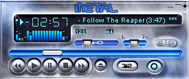
neon metal
my 1rst skin ever...
my 1rst skin ever...main idea is to have a skin with blue neon lights on the metal base!
it took me a lot of time to do it!!
so the rest od the windows didnt get much attention
if you like it - enjoy it
if you don?t - don?t spit on it!
__--stone--__
| March 2, 2006 by Slaven Vincetic | 85119 downloads |

Staff review
I'll spend about as much time on this review as you did on the other wind.....
Sorry, time's up.
Comments
Cool looking - I liked the main window I think it looks very good the media library window could have been made a little more shiny but I don't keep those windows up any way you can see every thing realy well it's easy on the eyes and my 2 favorite colors ^_^ it was a good thought any way and it's the thought that counts - June 25, 2006 by Iris West
nothing - I support the staff on this one, that this skin just plain sucks. I've already given enough just to rate it. Not worth it now, but might as well finish. Windowshade mode is crappy, and there's really nothing to look at on the skin, nor does it look at all appealing. But good job, you did manage to get me to give ya a 0ne, I don't give them out much, so be proud that you're one of the few that had earned it. If I could give a zer0 I would, but I don't think a zer0 is allowed to be given. - June 23, 2006 by Aero Tech846
I won't spit on it, but... - The main window'swinshade mode is crap. Close and winshade buttons are missing from both the PL and EQ. There isn't even a depressed state for the EQ-PL buttons in the main window, let alone any proper windowshade modes. For those confused what 'GLASNO' means, it means 'loud' in Serbian. - April 28, 2006 by Stefan Rosic
smudge - I think it is a bit smudged, and the readablitity of the playlist editor is pour - March 13, 2006 by E Duif

 Home
Home
