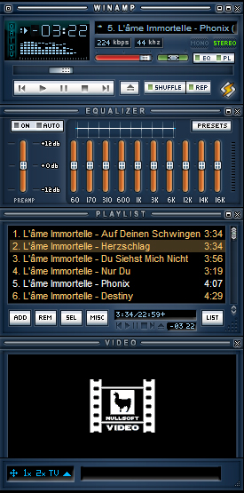
Neoclassic_V_1_2
It's both new and classic
It's both new and classicIt emerged from the idea of updating the original and lightweight Winamp Classic skin
| February 10, 2007 by Leonard Chioveanu | 306323 downloads |

Staff review
Nice update of the old style classic skin.
Comments
Excelent new design. Great! - February 11, 2011 by Kudos Kosher
Great skin. Simply beautifull! - December 17, 2010 by dIEGO
coloured classic skin - coloured classic skin - June 10, 2008 by acer vatim
Superb - A brilliant classic skin that should be the new default and replace the old one. Thanks for this great skin. - December 17, 2007 by John Kostelo
Well executed - Nicely done skin. Wish the original winamp looked like this.Any chance of getting this with a black shell? - September 30, 2007 by Zen X
Liked it when I first saw it. - Great Skin! I like the skins that are well thought out and simple butn very pleasing to the eye and the buttons have to be readily available and do what they're supposed to do. Great skin, Leonard. Like it alot! - September 4, 2007 by William E. Bromlie
Umm... - So you've changed dark and green to blue and orange. I kind of think the normal winamp classic was cooler, but it's still an okay skin. - August 11, 2007 by Ed misc.
quierp - hola quiero saber sime dan la autorizasion para descargar el winamp - July 7, 2007 by edgar oqueli moreno sierra
perfect - just perfect. - May 7, 2007 by mue .
classic skin - very nice rendering of classic winamp skin - April 29, 2007 by Horatio Caine
Looking great - Its clean, it has no fat or bloat. And it looks great while being very functional. I just wish the main buttons on the player in shade mode were better visible. - April 4, 2007 by Hawk .
\o/ - Dunno why, but I just love it d:E - March 31, 2007 by Abi S.
Great Skin! - It'll be my classic skin from now on. Still I think it needs a little improvement hence it looks a little ponderous to me. I absolutely agree that it has to be the default classic skin. - March 24, 2007 by Alex Angelov
Really like this one - It's nice and clean. Easy to use. Old habits are hard to break : ) - March 19, 2007 by Troy G
Well Done - well done man, this skin is absolutly replace the default classic skin - March 8, 2007 by Refano efan
Stunning! - Im a classic kinda guy, modern is just to much for songs, this skin is great, gives the old classic version a makeover and the colors and everything work perfect together, the author of this is genius, will be using this for years to come, this is now my new classic, thanks so much. - February 18, 2007 by Chris Noe
Excellent idea - Winamp's classic skin did need a refresh and you sure did a great job. It should now be the default skin!! - February 13, 2007 by Nicolas Lavergne
Very Nice! - Very nice skin! Smooth and clean! Good work! - February 13, 2007 by Luis Homocianu

 Home
Home
