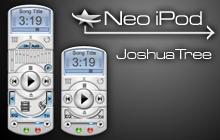
Neo iPod
Featured Skin, June 19, 2003.My first Winamp 3 skin. Inspired by a winamp remote for Desktop X.
Download skin| June 18, 2003 by Joshua Stachowski | 358161 downloads |

Staff review
Tiny.small, but functional mp3 player. try it out.
Comments
Escape - Itz awesome - January 9, 2006 by Kalyan Vempati
Thumbs up.... need colors - An overall great skin. It's tiny, so I can actually have it open over my other windows! Both the thinger and the EQ is integrated into the skin which makes it very clean and smooth. The only drawback is the lack of colors, which keeps me from making it a perfect lime green........ good job josh - June 18, 2005 by Michael Burns
Good work, but... - WHAT IS IT? GREAT SKIN, but is it imitating an iPod, a remote, or an MP3? People are like 'Neo iPod' then 'Nice MP3 player' then 'Modeled after a remote' I'm confused! :( Not my cup of tea, but it's a nice, functional skin. - March 21, 2005 by Katana Akaissei
Great! - I love this skin! Its compact and yet is still simple to use. The animations for the EQ and thinger are very well done. The one thing that would make this skin all the more awesome would be some cool color schemes. Great Job! - July 31, 2004 by Jonathan Chasteen
good stuff - I like this skin becase of the shape and the way that every thing just gose together. The fact that it's so small also helped. Last but not lest is the fact that the equalizer and thinger are part of the main window. So in my book this skin is the coolest. - October 21, 2003 by joey tester
normal - It's too small , I think . - October 13, 2003 by gong aiguo
I like it - It's a nice smooth skin. Best of all, it's small. Not a lot of variety as far as color schemes, but it's still good. - September 21, 2003 by Dante _
ORIGINAL - JUS BLAZIN !!!!!!!!!!!! - September 5, 2003 by Ivon Valerie
Not Bad - A little too cluttered for my tastes. - August 18, 2003 by Eric Hysen
good skin - very goods - July 10, 2003 by Tsui Ying Wai
nice look but... - this is a really nice skin, but i'm really picky about not being able to see the winamp and my browser screen also...if this had a thin horizontal mode instead of the thick vertical it would make the skin perfect. other then that tho, nice work - July 10, 2003 by amanda alksg
Simply WoW! - This Skin really whips the Llamas ass! this is the best Skin I have ever used! I registered just to say something about this skin. It is so smooth, and small and it takes up so little sys resources. Thank you Joshua Stachowski. touche . - July 9, 2003 by S D
this is what i've wanted - So sweet, so minimal, exactly what I want to play music. I don't need half my screen taken up by some space hog of a skin if all it's doing is playing music. - July 6, 2003 by Tim Goddadr
Question - I love the skin, but is there any chance of you downgrading it to Winamp 2.91? Winamp 3 will simply not work on my system - June 29, 2003 by Leo Green
Stop Button - This is a beautiful skin. Great functionality. But I noticed that evert 3rd time I press the stop button it doesn't work. I'm left having to pause my song if I want it to stop playing. - June 22, 2003 by Carlos Pla
title-less - from the screenshot, i thought this skin was actually quite...bleh. but when i downloaded it, i fell in love. its so compact and the love those buttons (IE: play). my main problem is how the icons in the thinger look. most of them arent smooth at all. i also think there should be something else to the screen too, but what you have now is very good... - June 22, 2003 by Cant Tell
THIS IS AWESOME!! - The size is perfect, nice clear type, smooth unobtusive shape.. Perfect 5 starts!! - June 11, 2003 by nacho man
Incomplete concept... - For such a cute, compact skin, this one seemed to get misdirected. Why not go through the trouble of having built-in visualization to the main, along with the color themes you didn't bother making? Where the main is small, the playlist editor, et cetera, are bulky and ugly. Some of the buttons seem half-done as well, like the shuffle, crossfade, and repeat ones. Where are the other modes? The staff were definitely too generous in the stars they gave for this skin. - June 9, 2003 by Circ Aloriath
Screenshot misleading - At first glance, this seemed like any other tiny skin, but after downloading it and trying it, I give it two thumbs up. Great design, great functionality, it's original, too... Great stuff - June 8, 2003 by Alek Apkarian

 Home
Home
