MTL
It used to be clean...
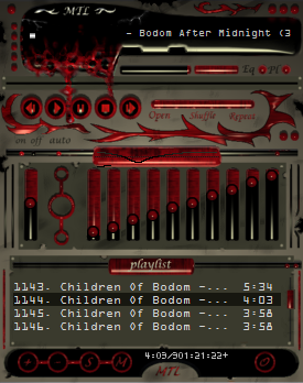
It used to be clean...It took pretty long to finish this skin. I just kept polishing it all the time. Then I suddenly realized it was boring and I dropped it to the floor few times and it got a lot better!
Download skin| August 2, 2005 by Niklas Kalliotie | 347679 downloads |

Staff review
Heh, creepy.Nice design, but not that "pretty". I'm sure that there'll be plenty of people who will like this look. It's a well made skin anyway, fully skinned, and with no visible bugs. Nice transparency too.
Comments
awesome skin - it's simple, clear and looks bloody enough ^_^ - December 24, 2007 by Lucia Echelon
Dripping alien ooze! Schweet! - Interesting effect, the dripping goo of alien lifeforms, spilling over onto the simplistic design of the alien technology face plates is something to be enjoyed for a long time. Easy to read play listing and controls thoughtfully laid out make this skin lay claim to style, design and ease of use kudos! Nicely done! - July 19, 2007 by Harry Beamish
genius ! :D - wow ! that's an awsome skin ! nice music too btw ;) I realy like this one thanks for sharing it . :D - June 4, 2007 by vera veldhuizen
scarey - yes i like the skin very cooooool. - October 26, 2006 by julie cargill
sweetness - just what i was looking for. colors and function are awsome - August 26, 2006 by matthew seward
very - Real good. Damn good to be honest. - June 23, 2006 by Aero Tech846
B-E-A- utiful - very nice im new with winamp and i find it very easy to understand + i like your music - March 9, 2006 by adam mospens
Good skin... - You have a good skin here going and would be 5 stars if it didnt have the tribal looking strips in it. Overall great interaction and layout. - February 24, 2006 by Mike Smith
Hmm... - Cool style, but not perfect. 4 Stars - November 25, 2005 by JM Ullrich
Hells Yeah! - Was a bit confusing at first, but thats cause I've been without winamp since version 3..... Now that I remember/found what it can do, I love it! And this skin totally kicks ass. The first one I've ever kept for more than 5 minutes... Finally, one that looks AWESOME and works perfectly fine! Thanks alot Niklas Kalliotie! - August 30, 2005 by Damien Vryce
Your Skin - I like this skin. Hail Bodom. - August 24, 2005 by Rik B
LOVE IT! - Its the perfect design for me! i love it! it has that creepy vibe to it. - August 24, 2005 by Ashley Thames
Wow - This is the sickest thing I've ever seen... But that's in a good way, though. It's kinda confusing at first but I've had it for like 2 minutes, and I know what to do. Yeah, I like this, its really cool! Make more, you're good at it! - August 23, 2005 by Emily Handzel
Nice. - The blood is a really cool effect, along with the inclusion of a skinned media library and a badass cursor, though it is a bit dark in some places, namely the playlist. All in all, awesome skin. - August 21, 2005 by Josh Fullah
Not that good... - I beg to differ from the masses, but this skin really isn't that good. It's not very usable, looks like crap when not stacked exactly the way it's done in the screenshot and it's way too dark. On the bright side, the blood effect in the main display is quite cool - you could develop it further, but you definitely should develop overall design at the same time. Give this skin some definition of it's form and a more unified look and it would work far better. - August 19, 2005 by Martti Roitto
GORE - I love the bloody/gothic look. Interesting and yet still simple. Only downside to this skin is that the playlist font doesn't quite go with it.. for some reason it doesn't seem right to me.. but I like it needless to say. Good to have a different font in there.. Excellent work! - August 16, 2005 by Neil Thompson
Niiiiiiicceeee... - That's a real cool skin...love it! I think that's like the first ever skin I ever fell in love with. Heh..well, it doesn't look very complicated but the look itself (to me!) is really sweet. Great job, Niklas! - August 13, 2005 by Sikchya Limbu
EXCELENT - that is a nice classic sking - August 12, 2005 by Carlos Recinos
Make more!! - This is the skin I was waiting for. It goes perfectly with my theme. Great job. Hope to see more skins from you. - August 7, 2005 by Sergio Luis
infernally beautiful - you've only got to get used to the cursor for some time... - August 5, 2005 by Karolina Milewska
laptop not - its a nice skin in all but with my laptop it was very dark and hard to spot the buttons. - August 5, 2005 by david davis
Awsome - This is an awsome skin. very well constructed. I love it. keep up the good work.. This is awsome. - August 3, 2005 by Nameon McGregor

 Home
Home
