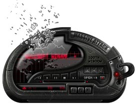
Massive Attack 100th Window
Featured Skin, March 20, 2003.Massive Attack. With dark shades of dub and songs that stretch with patient grace, 100th Window finds trip-hop legends Massive Attack at it again. Check out the Official Massive Attack Winamp 3 Skin. Be sure to check out www.massvieattack.com. User Interface and coding by Petrol Designs.
Download skin| March 22, 2003 by Petrol Designs | 430458 downloads |

Staff review
very nice...Check out the Skin and the website!
Comments
Not bad!! - Cool looking skin, could ease up on the glass affect at top, just lighten it a bit, Media Library wouldn't expans so kinda cramped. Other than that very cool, LOVE the black and red, awesome look. A little tweaking and this is one of the best around - July 17, 2005 by Wolf Bringer
It`s kind`a cool... - I like it... wha` can I say... it`s great... but it really could use some colour schemes :) - January 20, 2004 by Rayvon Luke
Not bad... - Well, the skin is Graphicly apealing and overall well done, but it could do with more intuitive navigation and perhaps more color schemes - July 24, 2003 by DJ Ojay
Cool, but... - I wish it had more color themes... - July 19, 2003 by Anca Demian
COoLLLLLLLLLLLLL - COolllllllllllllll - July 9, 2003 by sebastian zabant
future proof - This is just really really really amazing, and great for the feel that the music of Massive Attack brings to you, and when i first thought of it i thought it would be blue and silver because of the cover art for the CD booklet, but the red and black is just great, the text is very nice even upon the black, and if people think it's hard to read some, use the tooltip display, also nice work on the broken glass, brings back memories of the CD even if your not listening to Massive Attack. I'd like to see Petrol Designs do some other skins for Radiohead, Orbital, Moby, and Interpol, because the work on Massive Attack is great, and great things could be done for the other bands. - June 8, 2003 by Matthew Collette
A wee skin - cool skin, but the small buttons with the black makes it hard 2 navigate - May 26, 2003 by David May
GREAT SKIN - Very coooooooooool skin, i love the broken screen, this is a very creative design of a skin,a really good one, the only thing it's that i can't find the winshade button, but soon i 'll do it i guess. In the picture doesn't look very nice, but get it and you will see it's a very nice and great skin!! - May 2, 2003 by carlos villegas
i have a word for this skin... - huh? - April 23, 2003 by Kelvin Marrion
well.. - i think it's really nice, but it's too bad you can't move the main window and the playlist together... - April 13, 2003 by julia kahsol
creo que... - creo que no es muy bueno esta muy obcuro y no se mira claro las funciones - April 8, 2003 by octavio mora
Too dark - The skin's too dark. I hardly found where volume is... - April 6, 2003 by Gennady Shpak
warlord123 - tite!!! I think it is cool.capital C.i think that them petrol desings people shoud make MORE like it.:} - April 1, 2003 by ERICK YUMAN
I'm - It's Unique I can't find a words for this :)) - March 25, 2003 by ivailo stefanov
thank's - thank's a lot - March 23, 2003 by tony elia
not outstanding, but still great - hmmmm staff, this skin is better than a 0 rating! - March 20, 2003 by Stefan Ertmann
Attack This... - Right On! But hard to read a bit. - March 18, 2003 by marie bozo

 Home
Home
