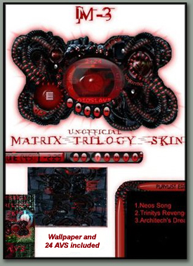
M3
Wow.....
Wow.....This skin is a Tribute to the Matrix Trilogy. Afew Artists and Programmers (Neoreality) got together in the Winamp community forums and made this skin.
NEOREALITY is:
SLOB- Main Coder
RONTZ- Light FX
XCALIBER-AI- Graphics
WITMER777- Graphics
Dan Wenner- Standard Frame
CARLOSP- Manual
LEECHBITE- Coding
DEISELx4x- File support
Icegod Color- Presets
QuadHelix Graphics/Teamlead
Skin features
Wallpaper download
24 AVS download
Special Light FX
much more....
| February 25, 2004 by Neoreality M3 | 300711 downloads |

Staff review
WOWWhat a blast this skin is, chock full of neat effects and stunning visuals, a must for all Matrix fans.
Comments
Abstract Time - I see this skin was made is 2004. It's 2007 now. Wow. You were way ahead of your time. No wonder ppl didn't get it when you put it out. Very cool skin for abstract minds... ;-) - January 10, 2007 by Kellyann Malkowski
Looks aren't everything - Looks aren't everything - Yes, it looks mean&cool, but it's not something likely to be used by me as a skin. When I open winamp to play some music, I want a skin, not a wallpaper. So I have to rate it 5/5stars as an interactive wallpaper, but only 3/5 as a skin. - September 27, 2004 by Sam T
rate the skin - this skin rulzzzzzzzz - June 1, 2004 by berdios lol
Huh? - All I can say about this skin is that it looked like someone threw up on my Winamp. WAY too confusing, and sorta painful to look at; not the experience I was looking for at all. - May 30, 2004 by Mike Hemmerling
wOw !!! - Looking at this skin for several seconds sends shivers up'n'down my spine. I love it! - March 25, 2004 by Marko Pichlak
AWESOME - no other word that would best describe it AWESOME - March 24, 2004 by almino malaza
Eh... - I'm a bit disappointed... When I first saw this, I thought "Man, that looks awsome. I think I'll try it", but when I DID get it on my desktop, there was a few things that HORRIBLY detracted from the skin. 1: The playlist looks out of place. Doesnt look polished, and seems to not "Fit". 2: It is extremely apparent that whoever made the main window for this skin did NOT make the buttons. The buttons dont look as visually pleasing, and seem half done... They dont fit, and look like they were quickly done. Also, when the skin changes form, the buttons look horrible. THey are the same quickly done Ovals that dont have any originality. 3: The font in the middle Eye area. Horrible. Doesnt look sleek or nice, It just givs it a faked "Horror" look, which this peice wasnt going for. 4: No visualizer in the middle. I didnt see any visualization in the middle... There's a lot you could have done with it. 5: The Middle Has too much catching you eye, and pulling your attention away from the very center. If it was simply a shined, Sleekly eery eye without the text and options, it would have made this a LOT better. I am not saying I could necesarrily have done better, I am just saying you guys had MUCH more potential. I feel like with a little more work, this could have been a true keeper. - March 22, 2004 by Scott Kuehnert
Colour Themes - The colour themes aren't very good, and it appears a little jagged and small. it's not as good as I had hoped, but I'm sure the next release will resolve a few issues. - March 2, 2004 by Adam Luttman
HOLY CRAP! - Wow, I have never seen such a good skin, especially one that is designed for winamp 5. all the other good ones are mostly for 3. DAMN, this one rules and i will definately be using it for a LONG TIME. - March 1, 2004 by matt ellison
Amazing Work!! - Now this is one amazing skin. This is true art work right here. I bow down to this artist. - February 27, 2004 by Corey Chadwick
AMAZING - This is one of the most visually pleasant skins I've seen! The "manual" is handy and neat, too. - February 26, 2004 by Chris R

 Home
Home
