Lapis_Lazuli
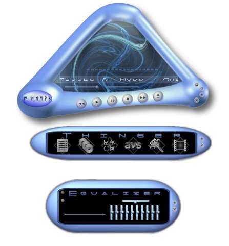
Featured Skin, March 13, 2003.The smooth blue skin - brought to you by Jamie McDonald.
Every feature of Winamp3 has been skinned. This is my first ever skin. Lapis Lazuli is a smooth blue gemstone just like my skin. :)
| November 15, 2003 by Jamie McDonald | 565429 downloads |

Staff review
Triangular winamp.different shape for a different user.
Comments
Nice - Very nicely done. Maybe the next version could have the center graphic actually swirling? - December 13, 2006 by Erin Gallagher
cool - thats ninice. real nice. kick ass. oh hell! its the best damn skin since new clear! - March 20, 2005 by Jesse Bergeron
"WTF" - Fitting cateogory, as I thought "what the fuck" when I saw this one. very cool. - May 14, 2004 by s zemla
WOW - But it didnt work... :'( - May 10, 2004 by minttu Nulppoin
Love it! - It's my favorite so far. Good work. - April 20, 2004 by Andrea Limber
inventive and slick - Love this one! Favourite so far... - January 15, 2004 by Bruce Elliott
like it... - could b better, but does its job. till now... *ggg* - December 26, 2003 by Martin Trebuch
oookkkkkk - its ok but why cant i change the color - October 1, 2003 by brad richey
interesting - It's a really neat design, and I like the color scheme (lucky for me, since you can't change it). There's no windowshade, but I like it anyways. - September 21, 2003 by Dante _
I wish..... - I wish you would have changed the menu so it was also blue in color, or at least matched. Not the same old gray and black. The media info editor wasn't the same color either, different color than the basic skin, but didn't match your skin either. Same goes for all the windows, I'm seeing a theme lol. You should have just toned down the main color of the WinAmp window that shows the play & all that jazz. Then it would have blended together and been really nice. But you didn't. - May 30, 2003 by Miss Deceptions
design almost nice - is it just me or does every winamp skin with curves on it look incredibly crap (curves should be SMOOTH). :( - May 1, 2003 by vesp *
very cool - Very cool skin. i love how the middle part is like....transparent. Great job. - April 23, 2003 by B B
Very good - Fantastic - April 4, 2003 by Paulo de Tarso Feital de Queiroz
Ugly WA3 button - Sorry, I know the guy personally and saying that really annoys him :) Nice work tho (he says grudgingly ;) - March 28, 2003 by Douglas Gresham
lais - lapis is super and i like ;apis heheh - March 24, 2003 by marek wojciech
Lapis_Lazuli - good - March 21, 2003 by Sirichai Uthaipaisalwong
?oea - ?oea aey ia?aiay - March 16, 2003 by Marshall Radziwilko
www - asdasdsd - February 23, 2003 by charcoal leung
purdy - this skin has a very attractive skin, but if you like to have your playlist up, look elsewhere. also the odd angles look awkward on the desktop - February 14, 2003 by natlie yarborough
Good - the design is good, but there are things that can be better. - February 13, 2003 by Yanizu Osborn
GOOD - Nice Design. - February 12, 2003 by ake system
Cool.. - Cool gfx! but not useful.. you should make buttons in shade mode a little bigger. - February 9, 2003 by Stefano Bagnatica
This is hot - this skin is hot that is y i give 5 star....nothin more to say - February 8, 2003 by jose adolfo

 Home
Home
