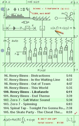
Lagrangiamp Dynamics
Pencil on engineering paper.
Pencil on engineering paper.A tribute to engineering homework. It's sort of a sequel to Euclideamp Geometry, although they don't look anything alike. Thanks to Luigi Hann and El-ArGeNtO (and Stillwater to a lesser extent:P) for their suggestions.
I got the cursor shadow idea from Cyana's "I Llama You."
| November 20, 2005 by James Potter | 201291 downloads |

Staff review
Different. The visual appeal is not the greatest, but then homework was never meant to be visually appealing.
Comments
MEGA-BLAST - perfect skin. i like the "flat article"-look. seems to be a real homework sheet. shadow only for the pen. good idea. for me there is no other skin. - October 4, 2006 by doc dawson
Nice skins! - Nice skins! Very thanks! - March 28, 2006 by Michael Babakov
Just beautiful. - I've been using green engineering pads for nearly thirty years, and I still love them. I've never before given a toss for skins - they're usually pointlessly flashy (if I want to see a pinball machine, well, I'll go play pinball) - but this is the one I'm sticking with. And I'm not even a Mechanical guy... Thanks very much. - February 28, 2006 by Yourname Here
different, simple and cool - easy to use, I have plenty of skins and this kind is my favorite, kinda tired of those hi-tech-views, this was a great idea. - February 27, 2006 by sergio dominguez
for the geek in everyone - i love this skin!! the precision pointer and simple layout appeal the geek in me. sure it's spartan, but that's what's great about it. no need for frills. nice work. - February 18, 2006 by rachel kendall
Interesting - This is a very interesting skin. It looks like it came from boredom maybe? It's not that hard to figure out everything. Pretty random thing if you ask me. But not that bad. I'll give you points for creativity - February 17, 2006 by Tim Gibbs
Good job - Seems like u really enjoyed your Euler-Lagrange stuff. Very good though. Two thumbs up. - February 12, 2006 by Amol Borkar
Fellow Engineer - This skin is awesome! It may not be the most visually appealing, agreed. But then, the true value of this skin can only be appreciated by those rehearsed in the study of mechanics... - February 10, 2006 by j k
Yes the color - I used to take my notes in white paper, but it'd be nice to have a "blackboard" version. - February 7, 2006 by Andres GG
well, too greeny - Nice skin... but the background color...oy! It is a fine work.... some effects wont be a bad idea. - January 21, 2006 by Stefan Nikolov
Brilliant - An excellent sequel to the Euclidean Geometry skin. I was also reminded of Maheshnarayan's Maths skin. I also appreciate the background color chosen for the Playlists (over the plain white used in Euclidean Geometry). The ccursor, volume levels, and static visualisation graph were really nice touches, as well. Thanks JJ. - December 5, 2005 by Aharon Varady
awesome - Very cool. A lot easier to use than Euclideamp, too. Not so hot about that particular green, but if that's the color of your graph paper, what can you do (I'm in Physics - we don't use graph paper). - November 22, 2005 by Jessica Henderson

 Home
Home
