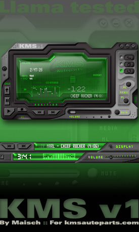
KMS v104
This is my first Winamp skin. Over 70 color themes animated drawers and more. Hope you enjoy it!
This is my first Winamp skin. Over 70 color themes animated drawers and more. Hope you enjoy it!KMS v1.04: This is my first llama skin, so be gentle:) I will be updating it again soon with one or two more modes, and replacing the custom vis with something a little more CPU freindly. Until then, enjoy!
Download skin| March 14, 2004 by G Maisch | 331977 downloads |

Staff review
Quite good.actually, pretty good, but some things are a bit hard to find, depending on the color theme. Tooltips might be helpfull.
Comments
An opinion for the best skin - Greetings from Romania! This is actually the best modern skin I`ve seen till now,but there`s one thing witch doesn`t fit:the progress bar is too small! I tried to repair this,but there are too many images ,I couldn`t edit anything :-) - March 29, 2006 by Ustinescu Ionut
nice ! - Nice choices of color ...love the glass look :) - February 21, 2005 by Laine Rose
Pretty cool - This is a very cool looking skin I like it The colors are cool and you can change them my problem is that all the components do not lock together if they are odly shaped - December 14, 2004 by Chris Farruggio
Thanx! - Thank you all for the kind words! Most of the issues mentioned will be addressed in future updates. As far as the tool tips go, they are there and only work proper when the player is stopped. It must be something in the maki scripts that is causing it to not display properly when the system is playing, I will track it down and fix it " I hope :)". Also in the next update I do plan on adding a slide out drawer from the top housing the vis/video elements of the player. Updates have been delayed due to my recent skin Orbis; it was just posted in the GUI Olympics. http://www.guiolympics.com go check it out if ya want! Thanx again for all the positive reinforcement!! Maisch - May 3, 2004 by G Maisch
Very nice, but... - Working tooltips are essential, man. If people don't like them, they can turn them off themselves. I, and many others, however, appreciate them when we are adjusting to a new skin. Yours showed up sometimes, but most of the time did not. The dang circle buttons for the playlist, display, etc. on the winshade mode are a little too small and can take more than one click to hit the sweet spot. You got some great ideas, but you need to polish a little more. You also seemed to "borrow" some design elements from MMD3, but that's not an entirely bad thing. I'll keep this skin, but I doubt I'll use it all the time with the few better options out there. If you could include my suggestions, plus make the winshade mode a little smaller (it's a tad big!), this would easily be my #1 skin. Black 'n silver - orange color theme is sweet! - April 20, 2004 by toejam 07
great job - This skin has found its way to my top three. The dark color themes go well with all of my desktop themes. Very complete, abet some of the controls are sometimes hard to see. I was a little disappointed when the playlist didn't lock to the bottom of the main window, but I got over it The only thing this skin and most modern skins lack is the integration of Vis/Video into the main window like the default:Modern skin. If you could place the Vis/Video, playlist and general options in pull-out drawers KMS just might replace MMD3 and Winamp:Modren as the Most Used Skin. - March 31, 2004 by Dark Shadow
Nice Design - I find this Design quite good. Not only because os its look, but also of the choices the user can make concerning to the different colours. Nice One, really!!! - March 27, 2004 by Guido Loerks
Uhm... Brighter themes? - Personally I absolutely love this skin... But there's a catch. The lack of brightly colored skins (Such as white perhaps). As this really doesn't go very well together with the way my desktop looks at the moment. A wider set of brightly colored themes in any future updates, would certainly make my day! ;) - March 21, 2004 by Alex Aune
Oh yes - This guy really knows how to do it. it remids very much of the MMD3 by Sven Kistner, but that's not a negative thing, there are three skins I use .. the original modern skin for winamp 5 (the best) then there are the MMD3 and this one, incredibly good work by Maisch - March 17, 2004 by Micael Svensson
This one, is a good one! - Very hi-tec looking. Too bad some details are very small and is easly missed. But the rest... Whoa! - March 15, 2004 by Peter Manning

 Home
Home
