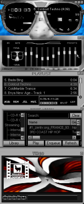
Ionu Shades
Hopefully more positive than negative Ions!
Hopefully more positive than negative Ions!Vidamp & cursors added
New update 09/30/04
I've given this one a simpler
look, & made that Black background(mentioned before)
Balance/Vol buttons, are different as is the overall
appearance..
Hope you approve of this one
a little more..
The whole idea of this was to
test my theory of skin tones.
Enjoy!
| September 29, 2004 by Lee Larsson | 43578 downloads |

Staff review
Approved...Thank you for your submission
Comments
uhmmm... - The Main window's ugly (esp. that nose), but everything else is pretty good. - August 26, 2005 by Mizu Haru
Ionu Shades - Personally I don't like this skin. Something about the snoz turns me off. I feel with some work and changes on this skin it could be very good. Maybe it's because I'm more into the retro and cool skin category. I really like the color version of this better than this one. I suggest that this person try again with some other design. Just my opinion. - October 1, 2004 by Eugene Edwards

 Home
Home
