i-Skin
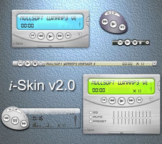
Featured Skin, May 15, 2003.Version 2.0 of iSkin for WA3. The skin has three modes:1. Main2. Remote3. ShadeThe main window has a slide-out equalizer. The remote and shade modes have a slide-out display that can be changed gradually from fully opaque to transparent. All modes allow elements of the display to be modified by clicking on them and the remote and shade modes allow two of the main control buttons to be changed by right-clicking on them. Finally there are nine color themes to choose from and a 'manual' available from the main menu.The screen shot shows various combinations of all of these options.
Download skin| May 22, 2003 by Paul Andrews | 258093 downloads |

Staff review
Not bad for a first skin.Can't seem to get to the "shade" mode.
Comments
i-skin - I must say--I was enthusiastic about this one from the display picture and description. 1. Interface--the skin has a clean interface all around. It's easy to find all the buttons without wondering what you're about to do to your music. Unfortunately, the time counter doesn't work. It's there, it just doesn't seem to display properly. 2. Modes--all of the modes are easily accessible and distinct enough to add variety. Throw in the colour options, all of which work fine with the skin. The toolbar mode of the skin is too small to be useful. 3. The "compact" mode is a nice option buttonwise, but the display to the right is too dark--so the time and song information isn't even readable. - February 15, 2006 by TwiceTranslated Brown
Seems to Work Just Fine... - I Found Every Mode... The problem is it doesn't have obvious Buttons.... You've got to Double click in a Certain spot... - September 26, 2005 by Carl T
What? - I downloaded but couldnt find any of the attributes mentioned about the skin- It dosn't look like the images of the screengrabs, I cant find any transparency anywhere & no different modes what is this? - July 25, 2005 by Gregor Shapiro
Needs just one more feature - This is a well-conceived skin with one big problem: getting to the playlist is a huge pain. I insist on using winamp in shader mode, and there isn't a prettier shader mode than the one on this skin. But I can't use it because I'm always messing around with my playlist. So what I use now is Moon_Groove, because it can be set so the playlist pops out when you mouse over the bar. And this is a huge, gigantic useability advantage. Now, this skin is prettier, and if it had this one auto-popout-playlist feature, it would be #1 with me. - November 13, 2004 by Usability Fan
by Paul Andrews - 16 - October 28, 2004 by Helena Zimackova
Underrated - It may not be funky or eye-catching like that other highly praised skins, but it is still well-made and very usable. I also love the ability to change tranparency settings. I only wish for more color themes. - February 29, 2004 by Thomas Ha
Very Cool! - Great skin. Very nice shade mode. An easier to read font would be nice, but this is now my favorite skin. Remote mode is cool as well. davidliv - December 27, 2003 by David Livingston
very good skin - one of the best skins ive seen, i like the color themes. - October 19, 2003 by ... ...
:T - the transparent thing on the shade is cool... the opacity buttons don't work for me though. and i was confused how to get it back to the main window... the timer thing showing minutes/seconds of a song doesn't work for me either.. :\ and there's no button for the playlist editor.. - October 7, 2003 by kko n
Now say it with me... - Brushed. Aluminium. Does. Not. Look. Good. See, that wasnt so hard, now was it? - June 5, 2003 by Blue Eagle
RE:ummm no offence - oops i ment quick amp sorry if i confussed ya anyway it is pretty nice in its simplicity i hope to see more skins from you :) - June 4, 2003 by David Sawatzky
i-skin - He is really good. - June 4, 2003 by alexandre richer
eh, its ok... - +1 star cause it looks cool +1 star cause it is well laid out +1 star cause of great usability -1 star cause winshade mode does not work...tacky -1 star cause additional colors are an eye sore...aesthetics are everything overall, its...ok. i agree with staff overall rating. - June 4, 2003 by mel hale
Cant Get it - When i download it, it tells me it cant open it and that goes for all of em..even when i put them in WinZip, it still doesnt work..what do i do? - June 1, 2003 by Ricky Juarez
i-Skin - I realize now that I can't search for skins by rating. It may just be a style difference issue. This is one of my favorite skins to date. Simple and modern. It may be "Nothing new" because we've seen the metal texture from iTunes and Quicktime but it's still my kind of tight. Well done Paul. Titanium next please. - May 30, 2003 by [ t r e y ]
good - good~~~~i like it - May 27, 2003 by chang kevin
Heh - I like the different skins for this skin...its compact, and you can still see it! - May 26, 2003 by Dream Weaver
Nice work...but... - but some of skins themes are very shiny. - May 20, 2003 by Alexander Tasic
Good but.... - Shade mode not work??? - May 18, 2003 by ake sunday
Its beutiful..... - ....for a first skin. Man, make more!!!! - May 11, 2003 by Faaez Kamaal
Great Skin - This is a good skin dont pass it up!! First to download!! - May 10, 2003 by QuadHeliX Barber

 Home
Home
