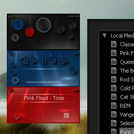
HARMONIA
This is my first skin making experience.
This is my first skin making experience.I tried my best for the best music player.I've always wanted winamp to take minimum space in desktop.I also tried to put all features needed in this skin.All the windows of winamp can be controlled by the main window.The library is designed to have clear and readable colours and fonts.It took a lot of time to find a stylish look for the buttons and the way they look you hover mouse on them.I'll be very thankful to know your opinion about Harmonia.Enjoy!
Download skin| December 25, 2006 by Behrooz Pakzad | 170077 downloads |

Staff review
unusal design and concept here
Comments
Nice! - Nice big easy to click on buttons! What a great idea! If this is your first skin, your off to a great start! - May 5, 2009 by Doug Thompson
Muy bien logrado - Es elegante y con lo necesario para satisfacer lo que como usuario de winamp busco. Es una de las pocas skin que utilizo junto a la bento y la big bento. - March 13, 2009 by Rober Pibe
It's wonderful - Hello Behrooz,Thanks :-)This is one of the wonderful skins I have seen & used..... As I have been using this skin for quite some time.. even my friends are curious to have this skin.The On/Off kind of buttons are really good.Thanks,Khwaja. - March 27, 2008 by Khwaja Mazharuddin
hmm - it's cool! - February 15, 2008 by min hye choi
EXCELLENT - NICE WORKSMALL CONCISE SIMPLE ELEGANCETHX BEHROOZONE OF MY FAVORITES - January 5, 2008 by me notu
Smooth - My favorite using 80% opacity. I love how this skin blends smoothly with dark flowing graphics. Keep up the great work! - December 15, 2007 by golgo thirteen
High marks for originality - Finally! Something new! - December 1, 2007 by m h
Zicovulo - Very good skin; I suggest you to change the black elements such the buttons in the main control window to yellow, in order to get a perfect harmonized skin an so on the playlist and the other windows in yellow or an alternation of yellow-red and blue colors; and we will have a perfect skin. - June 29, 2007 by Jose Triana
wait--what the heck is THAT thing...? - You have no idea how badly I want to love this lil guy. Er, guys--all three of them.But i can't make head nor tail of the media library--it's just this big square of black...however even as I write this I'm still wavering between giving you a 4 just anyway for neat design. So you win--i'll give you a four--but i likely won't keep my winamp set to this skin what with that issue wiht the library. - May 30, 2007 by tophie palmer
The Best Skin! - AWESOME! I love it. It is so different from the hundreds of other skins available and yet still highly functional. Yes, it takes a couple of days to get accustomed to where the controls are but after that, no problems. I have not had any bugs or trouble with this skin. Functional art. Bravo! - January 21, 2007 by beer48 wooley
Please fix those bugs!! - Creative and innovative!! takes some time to get accostumed and identified functions of every button. BUT IT IS BUGGED! Instead of the volume button I get A GREEN SQUARE WITH AN "X" THAT SAYS: "IMAGE NOT FOUND" and the same can be seen in the equalizer console. Please fix the bugs to give a sincere opinion. THX - December 27, 2006 by John Michael

 Home
Home
