grOOvegadget
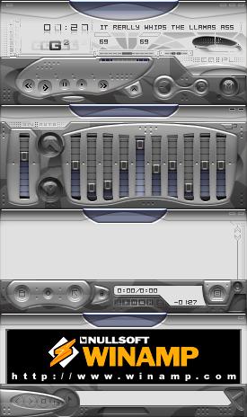
Featured Skin, October 2, 2003.nina will show u the moves...for now play with this gadget!!will ya...wa 2.9x compatible..have fun people! after a long slumber, my latest offering,grrroove gadget!!well, now , that things have changed a wee bit : i've made it brighter & more dull than ever, ( weird combi though) but to balance things a lot better, addition of the texture panel did the trick, wallpaper also included in zip format compressed along with skin ( remember hyperdrive??!!) regarding the wallpaper , here things really took a 'u' turn : my friends always pointed out to me that the wallpaper must be made to look like the skin > > bahhh humbug < < well, . . . . . . i present to u my" mecha supermodel "( modelled extensively in 3dsmax5 , thanx a miiiiiilion to global illumination ) nina in her weird seated pose just to make things a little wacky ( a la models posing with new concept cars ) wonder why?!!..don't know..anyway... check it out!! baby iiiiiiiiiii'll be back with more skins ( wierd ones ) hope to dive into it... also a suggestion for winamp developers : could u guys y'know , make a script or something from within winamp for wallpapers to load automically on the desktop,( like it should search for a wallpaper file and set it up on the desktop ) i think skinners should make a wallpaper to add up to their creation , that way people will really get the 'feel of the skin' the "look" even, like how windows xp has got its own wallpaper set up to complete the entire appeal of the os just to make it more inviting , attractive , satisfying!!....thumbs to a damn good player most loved by everyone across the world!!!cheers!!
Download skin| October 1, 2003 by neville dsouza | 63128 downloads |

Staff review
Approved.Good skin, but forget that wallpaper idea.
Comments
oNE OF MY 3 CLASSIC FAV - nOmOre - January 19, 2008 by nine kaa
two cents - You've colored the backgrounds of the text areas as brightly as the specularities on the buttons/knobs/etc. this is a bad move. it looks way too unrealistic. most of the time, that's not a bad thing, but it is a bad thing now because the rest of the skin DOES look realistic. this causes a major clash that does NOT look good. By the way, no more three-page essays for your progress descriptions. talking makes you look like a bumbling idiot, so stop. make more skins though. you're at least good at that. oh yeah, and "you" is spelled with three letters. - October 10, 2003 by Cyrus Draegur
RULES FOREVER!!! - THIS SKIN IS THE BEST FOR SURE, BUT ONLY FOR WINAMP 2, IF THERE WERE SUCH SKIN FOR WINAMP3, THERE WOULD BE NO COST FOR IT!!! ---EVERYBODY DOWNLOAD IT NOW--- or else - I WILL KILL YOU!!! - October 5, 2003 by Sergei Levitskiy
RESPECT!!!!! - This is solid!!! A very kick ass skin...well done and textured. Now I'm talking bollocks cos I'm just lost in the design so apologies to all concerned. Good skin. In fact...BRILLIANT SKIN. Respect to the maker. More like this please. :) - October 5, 2003 by Pete Morton
wow. - really really great work.. - October 4, 2003 by Daniel Whittal
Xelent! - Wow! So slick! Great detail. Overall - just totally wicked! I love the glass-effects. - October 4, 2003 by bunji design
damn... - that's good. - October 2, 2003 by Shaun Quinn
De lo ultimo, lo mejor - Entre lo mejor que he visto ultimamente. Una joyita. - September 27, 2003 by Veronica Mogni

 Home
Home
