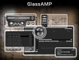
GlassAMPfinal
The final version
The final versionFinisheeed...
Thanx to Axialix for all his help....
| May 2, 2006 by Jeree Jeneekseen | 154678 downloads |

Staff review
Very smooth glass like skin, , nice if you like that kind of thing, also feature unique transparent frames as well.
Comments
Beautiful - Beautiful, Very Beautiful,Keep Up The Great Work. - August 23, 2008 by Joshua Wells
good, but ... - The skin looks quite good, but the volume control is no fun! - August 15, 2008 by Joe Trapp
polished glass > brushed metal - I download skins for two reasons, appearance, and features. The look of this skin is not amazing, but clever. Mixing pronounced highly transparent boundaries to the controls is, perhaps influenced by Vista. But, Jeree has included his own spin on the concept, varigating the glass around irregular shapes. Crossfade and track-repeat buttons are missing, which I look for. Also, the total playlist runtime is not present in the editor, which is handy. However, number one on my features list is included, being a sharply contrasted font color in the editor during playback. Thanks for that. I'll run this skin for awhile, and hope for an update, perhaps including what's mentioned above. Great job, overall. Very neat. - February 26, 2008 by g a
Simply and Stylish - I really like this skin, the only reason I am not currently using it is because the notifier seems to cause some lag in Firefox. Possibly that is because I have it plugged into FoxyTunes, will have to investigate that. I like the lack of clutter. It's a very elegant looking skin. The notifier is great, just wish it's would hang up Firefox. - June 11, 2007 by Fyral Doyesti
Great, but... - This skin looks amazing, but it crashes if you are trying to stream from the internet. I get a script/cover-notifier.maki error... Any thoughts? I really would use this skin but I listen to a lot of streaming audio like khaha.com, etc. - May 24, 2007 by Oleg -
cool - really is the coolest skin i found here.... - December 21, 2006 by Nanootka Nanoo
WOW - Best Winamp skin i found so far! really pretty and has a notifier :) - August 21, 2006 by shira nezer
An excercise in restraint... - This is just lovely. An exercise in restraint and understatement. Lends itself to almost any desktop due to the transparent edging, and yes, the notifier is very nice. Loses a star for missing out an obvious "colour tinting" option though. Excellent in general. - August 11, 2006 by matt thorpe
Not to Bad - Pros: glass effects are nice pop up notifer is really cool Cons: Layout and over all look is bland The components dont connect (To much space between them) No Color themes I dont know if its just not installing right or if there are things missing Im getting these green boxes with X's in them. Tho the con's out way the pro's of this skin I still have to give credit on the skin as a whole. Hope to see an update that will add to this skin soon. - July 2, 2006 by Jeremy Crouch
Wow! a glass player! - Good job on the skin. Nice borders Great Colors, very easy on the eyes. Love the notifier Would love to see option to customize the colors :) Great job anyhow! Keep it up!! - June 24, 2006 by Kunal Jadav
GlassAMP... final? - This is a great skin, stylish, simple and easy to use. The new buttons added to the main window (config and media) in this final version stick out a bit too much though, and because of the shadows, when trying to put it in the corner, it doesnt like to snap nicely to the sides. If it werent for those two little things, I'd have given this a 5/5. Maybe this could be touched up and another "final" version released? :P - June 8, 2006 by sol _
Rarelly nice skin - It's very smooth and simple, a real pleasure for the eye (allthough it takes some time to get used to the transperancy). Looking forward for other skins from the author. - May 27, 2006 by Nikolai Petkov
nice, very nice - I really like this skin especially the notifier. The only point of critic i have is that it starts to flicker when the scrollbar is used in the play list editor. - May 19, 2006 by Paramount retyp
Great Effect - looks great on the desktop. - May 10, 2006 by AuL ThaT
Awesome - .... and the only skin worth using since.... well not sure i remember when, it has been so long. - May 10, 2006 by Alex Lichtenhan

 Home
Home
