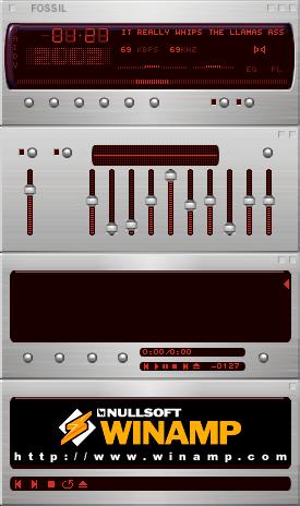
Fossil 2002 Classic
Inspired by the fabulous Fossil 2002 wristwatch.
Inspired by the fabulous Fossil 2002 wristwatch.My first Winamp skin, created during the absence of my former boss, when I was trainee at the design-bureau of Mercedes-Benz. I created this one in fascination of the Fossil 2002 wristwatch, which I purchased summer '98 in Heidelberg.
Download skin| October 30, 2003 by Jan Sott | 363091 downloads |

Staff review
greatCan't wait to use this in my mercedes.
Comments
minimalist bliss - I really like it, it v. cool - any chance of a releas for 2006 with different background colours? - December 7, 2005 by Ein irvin
nice - though its a bit too simple it is a good skin - April 16, 2005 by Benjamen Brown
One of the biggest skins ever - This is not a classic, this is a legend in skining. - January 13, 2005 by Tom Hespero5
Always a favorite - Through the past few years, this skin is always among the very first to go into the skins directory when I reformat a drive or get a new system. Would love to see a Winamp 5 version with color schemes. - October 27, 2004 by Jon Brook
Classic - Some things are cool, some things are good. But there are only a few which will last way after 'cool' and 'good' have been redefined. Guess the author already chose the appropriate name then. Get it. - July 9, 2002 by Vincent Leeuw
Still the best - One of the most simply graceful skins of all. - March 17, 2002 by Joel Haffey
This Skin Sucks - The buttons on this skin all look the same, which can screw you up big time. This skin looks like a piece of Dr. Evil's jacket from austin powers if anything else. Simple skins that design every part of winamp are cool, but one ugly color and one fucking button don't qualify. - March 15, 2002 by ross salituro
now in dutch - Goed werk. De kleurer passen goed bij elkaar en het heeft iets wat anderen niet hebben. E?n van de beste skins die ik hier heb gezien. For translation, mail: [email protected] - March 10, 2002 by raf schoonbaert
Nice - Easy to look at, great skin. - February 11, 2002 by Spencer Shaw
smooth - as another said clear and simple keep it up - January 4, 2002 by Phil Bond
refreshing - Simple, clean and uncluttered. Love it. No self glorification here just a great minimalist skin. Keep it up. - December 10, 2001 by Luis Diaz
original timeless classic - Needs no introduction. An early version of Fossil 2002 was one of the first Winamp skins I used, YEARS ago. Its appeal is timeless; it continues to be the basis for countless rips. And now it has EQ-shade and MB ... Damn, I gotta download it AGAIN. =T - December 3, 2001 by Dave Andrew
One of the better - More clear and simple than most. Two great colours, and it has so much class. - December 1, 2001 by Cesquis Cavalera
wow this got on techtv.com? - i'm amazed that a skin that doesn't show any real progress or talent made it on techtv.com - November 25, 2001 by weapon zero
Nice - Like the look a lot but would be better if it had labels for the buttons. - November 18, 2001 by Derek M.
Best Winamp Skin - I've been using winamp for years and in that timethis is by far the most classy skin, ive had hats off - October 12, 2001 by Neil Norpa
1000+stars - great simple and stylish.perfect coling perfect shading i love it!nice work jan torben scott!! i wish i had this in my car! - October 5, 2001 by eduardo flores
ish da bomb! - dis skin iz hexa tyte foo! how did yooh dis skin? wat programz? i luv da color! great inspiration! keep up the good work! - September 24, 2001 by Andrea Tran
this rules - simple & modern , what more do you want a skin to be? - August 9, 2001 by bacardi bacardi_
YES YES - screw the ppl who feel the need for outrageous designs. this is just way to cool. simple stunning, and goes so well with the up-to-date world!!! congrats bud - June 20, 2001 by Hamish McEwen
VERY KOOL!!!!!!!!!!!!!!!!! - I LOVE IT! GOES GREAT WITH MY BACKGROUND WHICH IS A RED LEXUS SC 430. THANK YOU FOR A GREAT DESIGN. - June 2, 2001 by Taonaya Fleury
Screams CLASS - Too "plain"? Has anyone heard the term K.I.S.S., used by artists? Keep It Simple Stupid - in other words sometimes the cleaner, sharper, simpler designs can be the BEST - the MOST elegant and scream of class! BRAVO to an artist with an eye for more tastefully done designs. - June 1, 2001 by Jamie Hiner
Jep, just the way guperseil wants it - Thanks a lot for this, i use it on all my machines. It is easy to use and beautiful. - May 8, 2001 by maria guperseil
Leon - sweet - March 31, 2001 by Leon Williamson

 Home
Home
