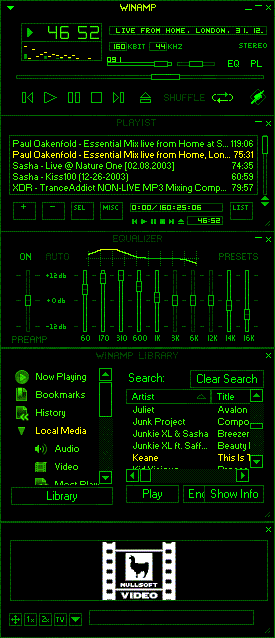
Dark Green Evo 10
Dark but easy to use skin.
Dark but easy to use skin.Dark Green Evo 0x10
17th generation skin by EJ
Playlist Font:
Set as "Small Fonts", which looks rubbish above size 9.
Change font size to 9 in Options>Preferences>Playlist>Appearance>Font Size.
Or just change font by dechecking "Use Skin or Language Pack Font"
Changes in Evo 10:
Changes in Evo 10:
Darker Frames, but PL & Media Lib Text brighter.
Added Main 3 Window Focus Indication; Displays Element name brightly when in focus, dark when not, thanks to request and help from James McCrary.
EQ sliders darker when 0db, brighter when moved, also colour change on graph.
Comments welcome
| October 18, 2006 by Cedric Fondle | 37751 downloads |

Staff review
Good if you want a clean, simple skin.
Comments
Clean cut, dark & bright, nice.. - My only issue is that it may hurt the eyes.. That sharp contrast between pitch black and sweet bright green. Nice tho. Buttons and toolz are clean cut, normal and hollow. Everything is where and how ya want it. It's got style, and you can clearly pick out which song is playing in the playlist. You took the bland but unconfusing classic, and shnazzed it up with groovy green style. Well done. I'll take that 2 go! - July 20, 2007 by Michael Muchowski

 Home
Home
