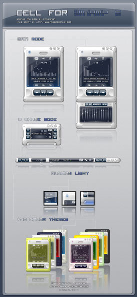
Cell
this is my first skin so i hope u can enjoy it ^^
this is my first skin so i hope u can enjoy it ^^cell : gfx and code by faris wijaya a.k.a faris18787 MAKI script by frisbeemonkey, enjoy it ^^
Download skin| August 20, 2006 by faris wijaya | 254823 downloads |

Staff review
First skin? Very good work without cluttering everything up.
Comments
Pretty neat - I'm using the greenish version and I'm pretty happy with it. The playlist menu could be a little longer by default but it isn't hard to tweak that. - October 4, 2009 by Dennis Tielmann
Very very very nice... - Clean, informative, easy to use, and the colour themes are a delight. The library and playlist are particularly well done, and they often get neglected. Keeping the playlist time display working is so useful! - February 28, 2007 by Mike Farley
You gotta have this one!!! - I love winamp, for various reasons. I love it even more for the talented people who make plug-ins and skins. I'm always looking for the top skin's BUG FREE, and this is my new top skin for 2007. Plenty of stuff going on here the colors are amazing. and by far the look is sooooo slllleeeekkkkk. NO BUGS, just perfect. I wanted the ipodNano to be my top skin. But this won my heart hands down. Excellent visuals and transparency. - January 4, 2007 by Scott Haynes
If only it worked! - It gave me a rather odd bug upon installing (something about a XML parsing error, no line at 39), then behaved oddly when I tried to change color themes. I tried reinstalling and it kicked me to the windows_classic_default skin. Three times. Despite this, I liked it. I especially like the sliding song notification and the kajillion color themes. I wish the media library and playlist were skinned. And I wish it worked. But that's just me. - November 25, 2006 by Jessica Tok
Really smooth one - I use this all the time. This one is my new favorite. Great job, keep it going ;) - November 2, 2006 by Oscar Andreasson
nice work - very clean design, good quality visually. Lots of colors to choose from. - September 29, 2006 by Alicia Gallagher
Absolutely Dreamy First Skin... - This is a positively gorgeous Modern skin and probably the best first attempt I've ever seen. Plenty of modes, but there's a special polish about the Stickmode I find entrancing. The glow, the attention to detail in the colour schemes (though I'd like quite a few more), the polished look the skin has overall, it's overwhelmingly professional for a first entry and holds its own with the work of veteral pros without breaking a sweat. The only thing that really jumps out at me about the skin in a negative fashion would be the Stickmode text. It scrolls perfectly, the typeface is clean and sweet, but it doesn't really seem to fit the rest of the skin. At 1600x1200, it's also a little hard to read, which may partly be the fault of my chosen colour scheme (with a shadow/black outline on the white text over an azure field), but as I peruse the available configs it seems to remain the least accessible of the skin's elements. It's not by any means obscured or totally unreadable, but I'd suggest the author turn a discerning eye toward the interface text for future editions. Overall, a magnificent entry and definitely worth a place in everyone's skin cache. Can't wait to see more from the author! - September 18, 2006 by Ike Eisenhower
just the way it is - Keren Banget... Matching ama Theme Desktop gw ups..i mean..this skin is cool.. not extraordanary tough.. but sleek and tidy... - August 24, 2006 by Miftah Rahman
Cool Skin COOOOOOOOOOLLLLL!!!!!!!! - This is realy cool - August 22, 2006 by John Bahmet

 Home
Home
