Cassiopeia
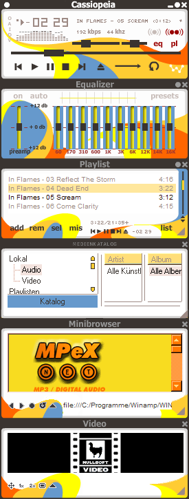
The first skin I finally finished to make :)
The first skin I finally finished to make :)I was looking for a slim lucid (but colored) skin which virtually fits in almost every desktop-theme (I'm changing it frequently) and is completely usable like the standard-winamp-skin (which is in fact very odd). I recognized that there weren't any skins to fulfill these desires at a time so I decided to make my own one. If you have any suggestions and/or fair comments on it feel free to mail them to me.
Hope you enjoy it!
| December 29, 2006 by Martin Feineis | 101273 downloads |

Staff review
Unusual colour scheme, slightly let down by the EQ
Comments
Beautiful, Very Nice - Very Nice Looking, Keep Up The Good Work. - February 1, 2009 by Joshua Wells
Great style - ... I love this skin. I have got it over year. You have got right ideas. Do more skins. - June 5, 2008 by Alli Jaros
agreed - The background theme is very good and so is the font of choice, but one is expecting more round designs and color variations, especially in the equalizer. I like the playlist a lot except for the position bar... the color of choice and form looks very odd for me; if this theme had been carried out in not only parts of this skin but throughout the whole one, I think this would be a very good one indeed. - April 14, 2007 by Sanna Fridh
Very nice, but... - I think the colours and design are awesome but I wish there was colour when you minimize the winamp window, because that's the way at least I use it 90% of the time, and that way it just looks black and white... Anyways, thanks for it! - March 30, 2007 by Alejandra Guerrero
Inspirational and pop - Great!! - January 12, 2007 by YoeF Santos
nice design, but could be better - I really like the colors and shapes of the background, but it's a shame that isn't somehow carried into the controls and such. It almost works anyway, but the components do feel out of place, especially the EQ bars. - December 31, 2006 by Luigi Hann

 Home
Home
