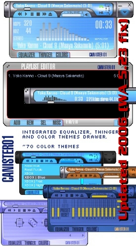
Canister 01
Making a skin alone is very time consuming. This could very well be my last skin (#2).
Making a skin alone is very time consuming. This could very well be my last skin (#2).**June 2006 Winamp 5.23 fix**
[v1.1]
This is something I made for myself, because I've found myself having my StarTrek LCARS AMP PADD II in shade mode most of the time. And I thought that it would be handy sometimes to have a player the size of one the larger shades in the WA community, but one that has a drawer.
Check out the two features I've implemented in the equalizer. Their implementation is cheesy, but they function properly, and useful. One resets the eq bands, the other cycles through the eq presets.
Wow, I never expected 200K+ downloads. I thank you all!
| July 3, 2004 by Jason Chiu | 484725 downloads |

Staff review
Its meant to be usable.not a good looking skin, but I dont think that was the aim. Certainly works.
Comments
Looks good - But a closer look reveals its lack of attention to details. If more time was spent on smothing out the edges(literally) this skin could be a lot better - July 3, 2007 by Peter Oswald
I think I like it... - There's a couple of odd aesthetic choices here, and the non-alpha edges are a little grungy, but I think it shows real promise.You put in the time, Mr. Chiu, and it's been well worth it, you've come up with quite a unique looking skin. All it really lacks, in my opinion, is a little polish. Feels like: a new flip-phone.Tastes like: not much, really.Goes like: a hydraulic delivery service.Try if you like: Compact skins, drop-down menus, efficiency, strange colourschemes. - May 24, 2007 by THUD~* Munkki
Clean, Intuitive. - Clean, Intuitive.I think Jason Chiu got this right. I found it very easy to use as soon as I installed it. Everything jumps out at you unlike most other cool skins were I spend more time trying to find buttons and functions.4.5 Good Stuff Brother! - May 23, 2007 by Tom Collins
Impressive - Seen lots of skins that looked great but funtionality was lacking. This skin looks good, compact and is very functional. Play list and Media Library is accessible in compact mode with a point click interface. Great job! - April 30, 2007 by Sjon Jones
Awesome! - This is one of very few good looking skins I've been able to find. It actually fits in the corner of the screen well and looks great! I've been using the default skin forever because I haven't been able to find a better one but I think the search is finally over. - August 3, 2006 by John Christmann
The very reason you cited........ - for making this skin is the reason it is one of my favorites. It's large enough to see all of the buttons and yet, small enough to leave room for other apps I might be using at the time. - July 12, 2006 by Jack Sanders
Note 1 - the best skin!!! - November 26, 2005 by Andy Matrix
I wish all skins were this good. - Quite attractive and very functional. It's very easy on the eyes. I like being able to easily tab through the presets and color choices. Very well done! - April 27, 2005 by Thomas Bryner
Damn ugly - I like the layout, but this skin needs a serious makeover. - April 7, 2005 by Jackie LeBlanc
Nice Blue - Nice Blue - March 4, 2005 by Antonius Tumplo
Demolition Inc - This Rocks it is now my default Skin - February 3, 2005 by Paul Roberts
by Jason Chiu - 5 - October 28, 2004 by Helena Zimackova
Very Nice!! - I love this skin, It's extremely usable... My only complaint is about CPU usage about 40% on an AMD XP 3400. Actually it's the only skin I ever used that used more then about 8% of CPU usage. Hopefully you will come out with a version 1.0... Great job on the skin, I will be waiting for your next version! - October 3, 2004 by Eric Strunk
By Rasta Nora - 1 Reviews - August 27, 2004 by Rasta Nora
I wish all skins were made to be usable - This is a nice, fresh and functional skin. Where the Nullsoft staff promotes the alien-shaped "freeform" skins, I like a skin designed with a clean interface. - July 18, 2004 by Pascal Getreuer
Very Good Skin - I dont know why it was rated Low. This skin rocks! Please download Now! - July 6, 2004 by QuadHeliX Barber
Rather Unfair - I think the staff review is a little unfair. The skin is very easy to use and looks great. The majority of the colour themes are good, I prefer the darker ones with good contrast between the player and the text. The only downside to it is the lack of alpha around the corners making them stick out rather. - July 6, 2004 by James Darnley

 Home
Home
