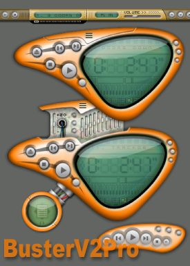
BusterV2Pro
Featured Skin, February 20, 2003.Buster.
Version 2 of buster
new features:
65 colorthemes
new shade mode "slim"
colorthemes window
shade mode chooser
and more...
special thanks to boostr29.
| February 18, 2003 by Rain P. | 207742 downloads |

Staff review
buster.Nice work on the eqalizer and thinger.
Comments
good one - that default choice of colors, i think is awsome. - February 21, 2004 by Veronica Martinez
very close to a 5 - i've tried ALOT of win3 skins and i deleted all but mm3 and this. the only downsides i can say are that as previously mentioned, there is a reflection above the displayed information. my second gripe is that the top thingy that pops up, on top, the black line doesn't go away, no matter what color scheme you have. if u like this one i recommend 'invicta.' - October 3, 2003 by n88tr grenlie
Reminds me of MMD3 - Its great, reminds me of MMD3, just without the bass and treble. That is why this is a 4 - September 9, 2003 by psycho 1981
Not Bad, Not Bad ! - It is small and that is a plus when you don't want a media player in your face. I like the color schemes. The thinger directional takes a good sharp mouse point to get it to move, but other than that, not bad! Keep up the good work, looking forward to more! - July 21, 2003 by Leslie Hart
Now that's what i'm talking about! - The added color schemes just make this one of the most versatile skins out there. It is small and compact and it is just flat out marvelous. Skinners take note: add color schemes to your skins and you will have it made. - May 6, 2003 by Grey Haven
"bustervpro" - it looks cool - April 19, 2003 by JULIO PALENCIA
Excellent Skin - This was a very thorough skin, I believe this is a ten star skin if there was such a rating. - March 6, 2003 by Zeke P.
Beautifull and simple - Cool originali skin.It is a great skin to listen!!! - March 4, 2003 by Denis Prudiev
Good skin! - The only suggestion I'd make is that the display is difficult to read and could be either darkened (the text) or lightened (the background). But, well, my eyesight isn't so great to begin with. - February 16, 2003 by Michael Smith
well, well... - the skin is very goood :> I love the color themes very much. There is only one problem - I ALWAYS confuse the minimize/close/modes buttons - why they are always so similar??? But the skin is impressing :> - February 14, 2003 by jo kowalska
Tastefully done - very well executed skin. the shade mode is especially outstanding. Buster offers a large number of well chosen colour themes, making use of an interesing colour gradient effect. only one drawback: in many of the colour themes the 'glass' is rather opaque. together with the small font selection, title and artist information can be very difficult to read. - February 12, 2003 by Jimdrix Hendri
small, useful, great! - this is a very great combination of a small skin, with fonctionnality, and as simple as beautiful. the only thing that could be improve is the position of the time scroll bar on the slim mode. I give you 4,9 stars :D good work, that's a really great skin! - February 10, 2003 by James GT
Good work! - Well-skinned, tips are almost OK (you should add a tip for the "change mode" button).. The shade mode is great, the slim not very good.. The normal mode I don't know because I don't use big Winamp! Good choice of colors (BubbleGum's nice)! - February 9, 2003 by Stefano Bagnatica
Yeah Man, just continue good work :-) - Just continue good work, make orange area of skin more smoth. and make everithing else more smother, make more color themes for same skin and you will become 5 stars from all. :-))) - February 9, 2003 by Nikola Scepovic

 Home
Home
