BadSyntax
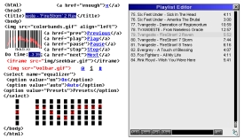
My first WinAmp skin almost tottaly transparent with a wrong HTML syntax.
My first WinAmp skin almost tottaly transparent with a wrong HTML syntax.My first WinAmp skin almost tottaly transparent with a wrong HTML syntax.
Download skin| October 16, 2005 by Eros Istvan | 35854 downloads |

Staff review
Original, but essentially useless.The concept is certainly original, and with some interesting ideas, but it's practically useless. You have to pixelhunt each and every time you want to click on some button, and the sliders are worse. The other windows aren't visually appealing as well.
Comments
clear - Im gonna rock this skin for, like AWHILE. - October 30, 2008 by timothy timothy
hmm... well I love it - I like it, I can keep it on my desktop and it looks sweet, not like most players which are in a box.... this is out of the box. Great idea, a little hard to use, but hey, it IS usable. - November 10, 2005 by Mike Formisano
why transparent? - The thing that really kills this is the transparency. It's hard to read it against most backgrounds, and almost impossible to click on the buttons at all without accidently clicking what's behind them. I would strongly suggest redesigning this skin with the html against a solid background. - October 21, 2005 by Luigi Hann
Huh? - The author made and damn right awful design-choice here :-S ... Granted, it's original, but you have to wonder if the author actually uses this on a daily basis himself? bunji - October 19, 2005 by bunji design

 Home
Home
