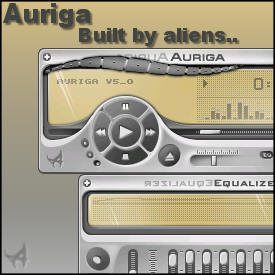
Auriga V5
History comes alive.
History comes alive.Auriga, based on the Winamp Classic skin by the same name. Another one of the early Winamp3 skins that was never completed. We dug this one up, dusted it off and present it here for your enjoyment.
Original Design by Kinwashi.
WA5 version by Mr Jones and Wildrose-Wally.
| April 20, 2004 by Nullsoft Skinz | 191953 downloads |

Staff review
Eurika.....hmmmm, Auriga I meant.Another fine example of the skinning abilities of Kinwashi. Glad to finally being able to present it to you.
Comments
Almost... - Make it bigger and add color themes. Its nice but totally unusable on my 1600x1200 monitor resolution - February 15, 2006 by T S
Nice Skin! - I was using the old Kinwashi-Auriga skin for a long time, and this one was a wonderful improvement! Great job! - May 6, 2005 by Michael Lynch
Nice :) - Good look and very readable panel ! - February 7, 2005 by Piotr Lek
at last a good skin:) - i were tired to see skins with no good docking, round or undefeined shapes, messed up buttons....at last a skin that beats up winamp2 skins's ease - May 8, 2004 by dm909 dm909
good idea - to use classic proportions but modern appearance. i hope there`ll be more skins like this. but... with also more color themes *) - May 2, 2004 by Brian Warner
clean and fun - skin is clean, smooth, and resource friendly. you get a lot of the bonus' of wa5 skinning with a nice clean feel. it is fast and responsive and won't eat a ton of resources while maximized. i agree some color themes would be nice, but i otherwise con't complain. - April 27, 2004 by kevin flynn
What took you so long? - Another very nice long-lost skin from Nullsoft! Very cool-looking, but missing only two small things: color themes (although the one included is very nice) and either a playlist editor winshade or a scrolling title in the main window winshade. With those, Auriga would be perfect, especially for those who like the shape of Winamp 2.x, but want some of the cool features of modern skins, such as rearrangement of the buttons, demonstrated by Auriga very well. - April 24, 2004 by toejam 07
Excellent! - I love the classic auriga skin. This one is excellent! - April 23, 2004 by Veronica Mogni
Nice ... but - Really like the look of this but feel its let down by the playlist. Were it's background the lighter brown (like the main panel) and the text dark, that would be a perfect skin :o) - April 22, 2004 by ran93r .com
Great - That classic Winamp default style Ive been missing. What you need though are some color themes and a playlist winshade - April 22, 2004 by Estepha Francisque
Good skin. - I like this skin since the first time I saw it. But I think it should have more color`s themes and a thinger area. Thanks and congratulations to you and the winamp team. - April 22, 2004 by Eduardo Dallana

 Home
Home
